Client: Dr. Branko Obradović, Belgrade, Serbia, oral surgeon

Client: Dr. Branko Obradović, Belgrade, Serbia, oral surgeon
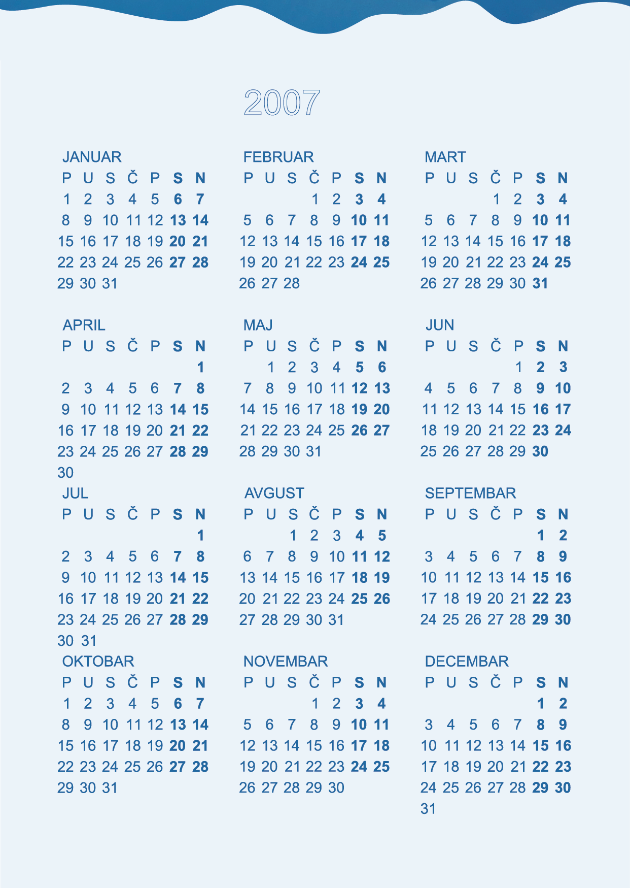
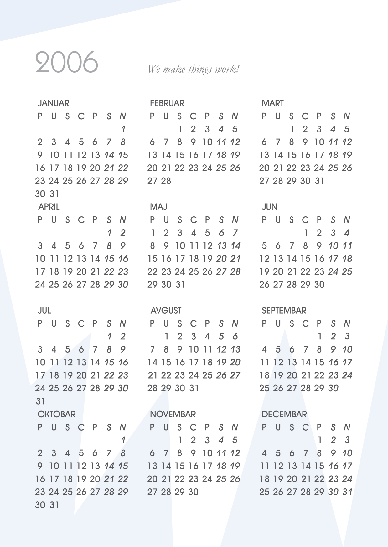
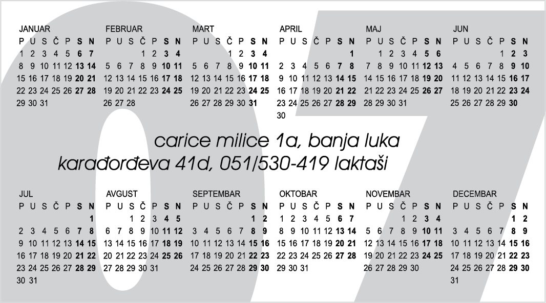
memorandum, prescription, table calendar, and sticky notes, 2006

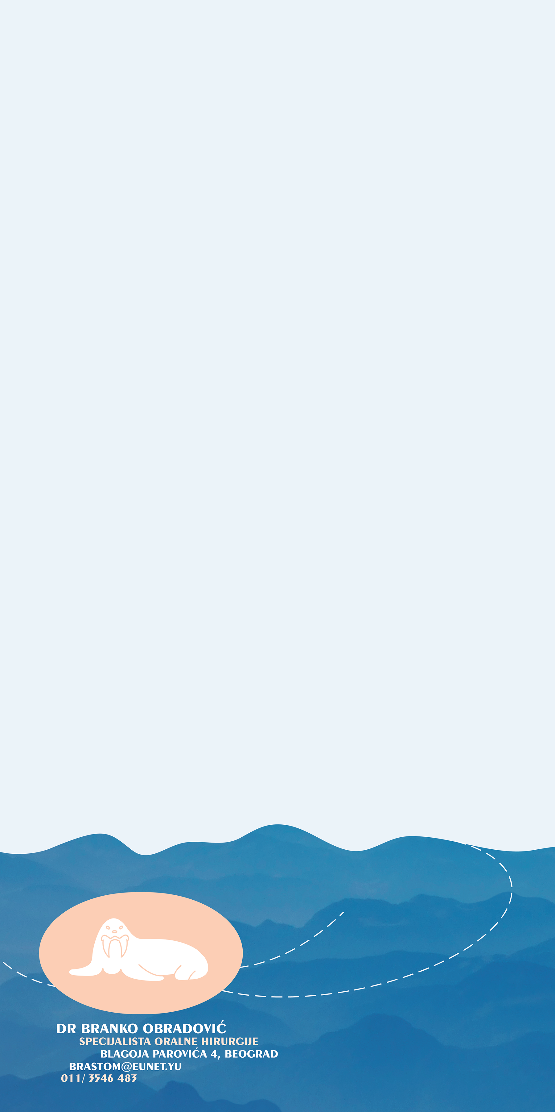
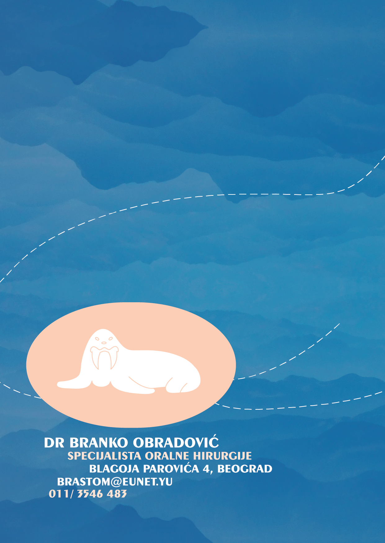
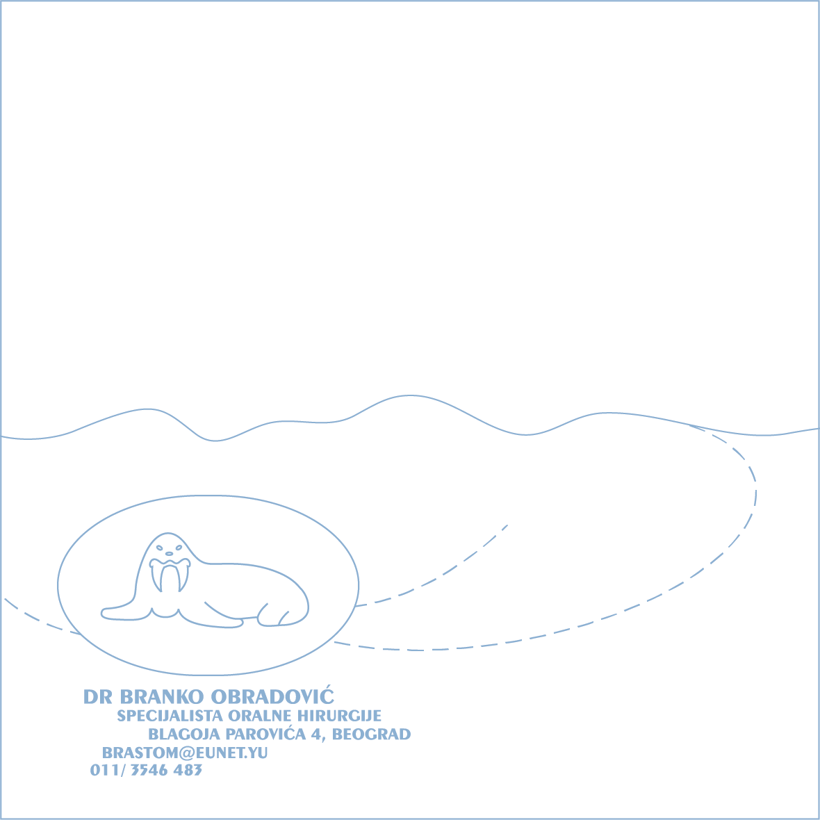
I am not the creator of this logo. However, I was asked to redesign the original, black and white logo and accompany it with a harmonic background which will give a sense of unity to the whole visual identity of this dentist’s office. The walrus’ teeth exemplify interest and profession of Doctor Obradović in humorous way. I put this marine mammal in his natural environment: the blue background indicates the waves of the Arctic Ocean. Since I did not have my own photo of the Arctic Ocean, I photographed the sky from the airplane and played with a composition in Adobe Photoshop.

2007: This table calendar was selected for the 11th Exhibition of the Most Beautiful Calendars and Christmas Cards, Museum of Contemporary Art of Vojvodina, Novi Sad, Serbia. Honorable Mention for Graphic Design

2007: The calendar was published in the catalog of the 11th Exhibition of the Most Beautiful Calendars and Christmas Cards, Museum of Contemporary Art of Vojvodina, Novi Sad, Serbia

Client: The Festival of Clean Rivers, Prijepolje, Serbia, a music festival

Client: The Festival of Clean Rivers, Prijepolje, Serbia, a music festival
logotype, 2006

Festival čistih reka (The Festival of Clean Rivers) was a music festival with an emphasis on ecology and the protection of Serbian rivers. The logo contains a wordplay based on the Serbian word for wave (val). The logo copyright is protected by the Intellectual Property Office, Belgrade, Serbia.

2007: Selected for the 8th ArtTech, International Festival of Digital Art, Students’ Center, Pančevo, Serbia

Client: Zlaja, Belgrade, Serbia, a publishing house

Client: Zlaja, Belgrade, Serbia, a publishing house
book cover, 2006

Jovan Jovanović Zmaj (Јован Јовановић Змај) lived in the 19th century in Novi Sad and he is the author of some of the most beautiful poems for children written in the Serbian language. I offered three different cover page designs to my client. The first two images are sleek and refined typographic compositions without illustrations. For the third design I used the pencil drawing of the boy who is riding a wooden horse, a motif from Zmaj’s poem. The drawing was provided by the illustrator who worked for my client at that time. I scanned it, colored it, and combined it with the title of the book, which is written in Serbian Cyrillic letters (Змајеве песме за децу). The client decided to use the third design. Since Zmaj’s Poems for Children sold very well they were reprinted several times.

Client: Minel Elektromontaža, Belgrade, Serbia, installing and maintaining electrical equipment

Client: Minel Elektromontaža, Belgrade, Serbia, installing and maintaining electrical equipment 
logo, table calendar, business card, and bookmarker, 2005

Minel Elektromontaža is a company which installs and maintains various electrical systems. Since their main activity is the lighting of streets, roads, and factories, the company’s directors accepted my proposal for the new visual identity: a bulb which is a universal symbol of electricity and illumination. The logo copyright is protected by the Intellectual Property Office, Belgrade, Serbia. The pale blue background represents thin glass of which they are made. The lighting effect was achieved with UV glossy lamination which covered the printed materials: wall, table and pocket calendar, business cards, bookmarker, and notepads.

2006: This table calendar was selected for the 10th Exhibition of the Most Beautiful Calendars and Christmas Cards, Museum of Contemporary Art of Vojvodina, Novi Sad, Serbia. Honorable Mention for Graphic Design

2006: The table calendar was published in the catalog of the 10th Exhibition of the Most Beautiful Calendars and Christmas Cards, Museum of Contemporary Art of Vojvodina, Novi Sad, Serbia

Client: Uspomena, Banja Luka, Bosnia and Herzegovina, jewelry stores

Client: Uspomena, Banja Luka, Bosnia and Herzegovina, jewelry stores
logo 1998, table calendar 2005, pocket calendar 2006

Although the logo is abstract, it is inspired by the decorations in jewelry design. The logo copyright is protected by the Intellectual Property Office, Belgrade, Serbia.

2006: This table calendar was selected for the 10th Exhibition of the Most Beautiful Calendars and Christmas Cards, Museum of Contemporary Art of Vojvodina, Novi Sad, Serbia. Honorable Mention for Graphic Design

2006: The table calendar was published in the catalog of the 10th Exhibition of the Most Beautiful Calendars and Christmas Cards, Museum of Contemporary Art of Vojvodina, Novi Sad, Serbia

2011: This logo has been published in the book Significity (anthology of the best 2500 Serbian and Yugoslav logos 1960-2010), Belgrade, Serbia

Serbian Railways

Serbian Railways (Железнице Србије), Belgrade, Serbia
national competition for the new visual identity, 2004

This logo consists of the Cyrillic letters Ž and S (Ж and С) which are the company’s initials (Железнице Србије). Three blue lines compose three highly stylized railroads which depict Serbian geography. Two thirds of the country (or its southern and central parts) are situated on the hilly Balkan peninsula: that is why the two paths, or two railroads are curvilinear. The northern part of Serbia is the flat Pannonian Plain and that is why the third line, or the railroad is straight. The logo copyright is protected by the Intellectual Property Office, Belgrade, Serbia.

2011: Published in the book Significity (anthology of the best 2500 Serbian and Yugoslav logos 1960-2010), Belgrade, Serbia

2011: Selected for exhibition The 50 Years of the Graphic Communications in Serbia 1960-2010, Museum of Applied Art, Belgrade, Serbia

2011: Exhibition The 50 Years of the Graphic Communications in Serbia 1960-2010, ITD Gallery, Petrovaradin Fortress, Novi Sad, Serbia

2012: Exhibition The 50 Years of the Graphic Communications in Serbia 1960-2010, Museum of Contemporary Art of Republic of Srpska, Banja Luka, Bosnia and Herzegovina

Client: Prvo Beše Reč, Belgrade, Serbia, a publishing house

Client: Prvo Beše Reč, Belgrade, Serbia, a publishing house
logo, 2004

The logo for Prvo Beše Reč is consisted of an initial P and a spiral which symbolizes evolution and expansion. Prvo Beše Reč in Serbian means “In the beginning was the Word…” The logo copyright is protected by the Intellectual Property Office, Belgrade, Serbia.

2006: Selected for the 7th ArtTech, International Festival of Digital Art, The Cultural Center of Pančevo, Pančevo, Serbia

2011: Published in the book Significity (anthology of the best 2500 Serbian and Yugoslav logos 1960-2010), Belgrade, Serbia

Dejan Mraovic, Prvo Bese Rec, logo

Amidža Konak (Uncle’s Residence), Kragujevac, Serbia

Amidža Konak (Uncle’s Residence), Kragujevac, Serbia 
ink drawing, 2003

Amidža Konak (Uncle’s Residence) is a building of Turkish-style architecture situated in the heart of the city of Kragujevac. The residence was built between 1819 and 1824 by Serbian Prince Miloš Obrenović, and it was named after Sima Milosavljević-Paštrmac, called Amidža (uncle).

Admiral

Admiral
logotype, self-promotion, 2003

Here, in the word admiral, the letter i is replaced by the recognizable admiral sign. According to the international system of navy officer sleeve rank insignia, admiral is represented by one wide and three thin horizontal lines and a circle above them. The logo copyright is protected by the Intellectual Property Office, Belgrade, Serbia.

2011: Published in the book Significity (anthology of the best 2500 Serbian and Yugoslav logos 1960-2010), Belgrade, Serbia

BFA Thesis – Idea

BFA Thesis – Idea
my personal logo, 2002

The powerful lightning appeared in the red sky creating a bulb, the symbol for idea. This bulb is a personification of my creativity and problem solving in graphic design and art. The logo copyright is protected by the Intellectual Property Office, Belgrade, Serbia.

2005: Published in Kvadart, No. 26, Belgrade, Serbia (design magazine)

2011: Published in the book Significity (anthology of the best 2500 Serbian and Yugoslav logos 1960-2010), Belgrade, Serbia

Lik

Lik
logotype, self-promotion, 2001

Lik in Serbian means shape. The red dot over the letter i came from the lower left corner. During a series of “jumps” the red dot made additional shapes (or holes) in the letter l creating typographic play.

2011: Published in the book Significity (anthology of the best 2500 Serbian and Yugoslav logos 1960-2010), Belgrade, Serbia

The Rosette Windows

The Rosette Windows
drawings made with Rapidograph pens, 2000

The beautiful rosette windows on the Serbian medieval churches and monasteries inspired me to manually draw these original compositions using Rapidograph pens and a pair of compasses. While the old medieval masters created “lace” in stone, I tried to design lively “lace” on paper.

Condottiere

Condottiere
logotype, self-promotion, 1999

Condottiere is a student work which I created during my undergraduate experience. My goal in this typographic exercise was to design an elegant logotype with very light appearance but with legibility at the same time.

2011: Published in the book Significity (anthology of the best 2500 Serbian and Yugoslav logos 1960-2010), Belgrade, Serbia

Graphic Experiments

Graphic Experiments
drawings made with Rapidograph pens, 1999

A Rapidograph is a technical pen which allows drawing of consistent lines. Although computers have made these tools almost forgotten today, I enjoy creating drawings using Rapidograph pens of different sizes. These graphic design experiments combine my passion for iconography, typography, grid, and patterns. The legibility of letters x, o, s, O, m, v and Y was not so important to me: I was interested in creating dynamic, sleek, and playful compositions.

2000: More and More, the group exhibition of the undergraduate art students from the College of Visual and Applied Arts in Belgrade, Students’ City Culture Center (DKSG), Belgrade, Serbia

Restaurant

Restaurant
logo, self-promotion, 1998

This logo represents a stylized spoon and a fork. The logo copyright is protected by the Intellectual Property Office, Belgrade, Serbia.

2006: Published in Kvadart, No. 27, Belgrade, Serbia (design magazine)

2011: Published in the book The 50 Years of the Graphic Communications in Serbia 1960-2010, (the best 600 Serbian and Yugoslav logos from 1960 to 2010 published by the Museum of Applied Art, Belgrade, Serbia)

2011: Selected for exhibition The 50 Years of the Graphic Communications in Serbia 1960-2010, Museum of Applied Art, Belgrade, Serbia

2011: Exhibition The 50 Years of the Graphic Communications in Serbia 1960-2010, ITD Gallery, Petrovaradin Fortress, Novi Sad, Serbia

2012: Exhibition The 50 Years of the Graphic Communications in Serbia 1960-2010, Museum of Contemporary Art of Republic of Srpska, Banja Luka, Bosnia and Herzegovina