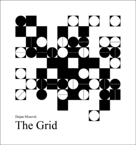
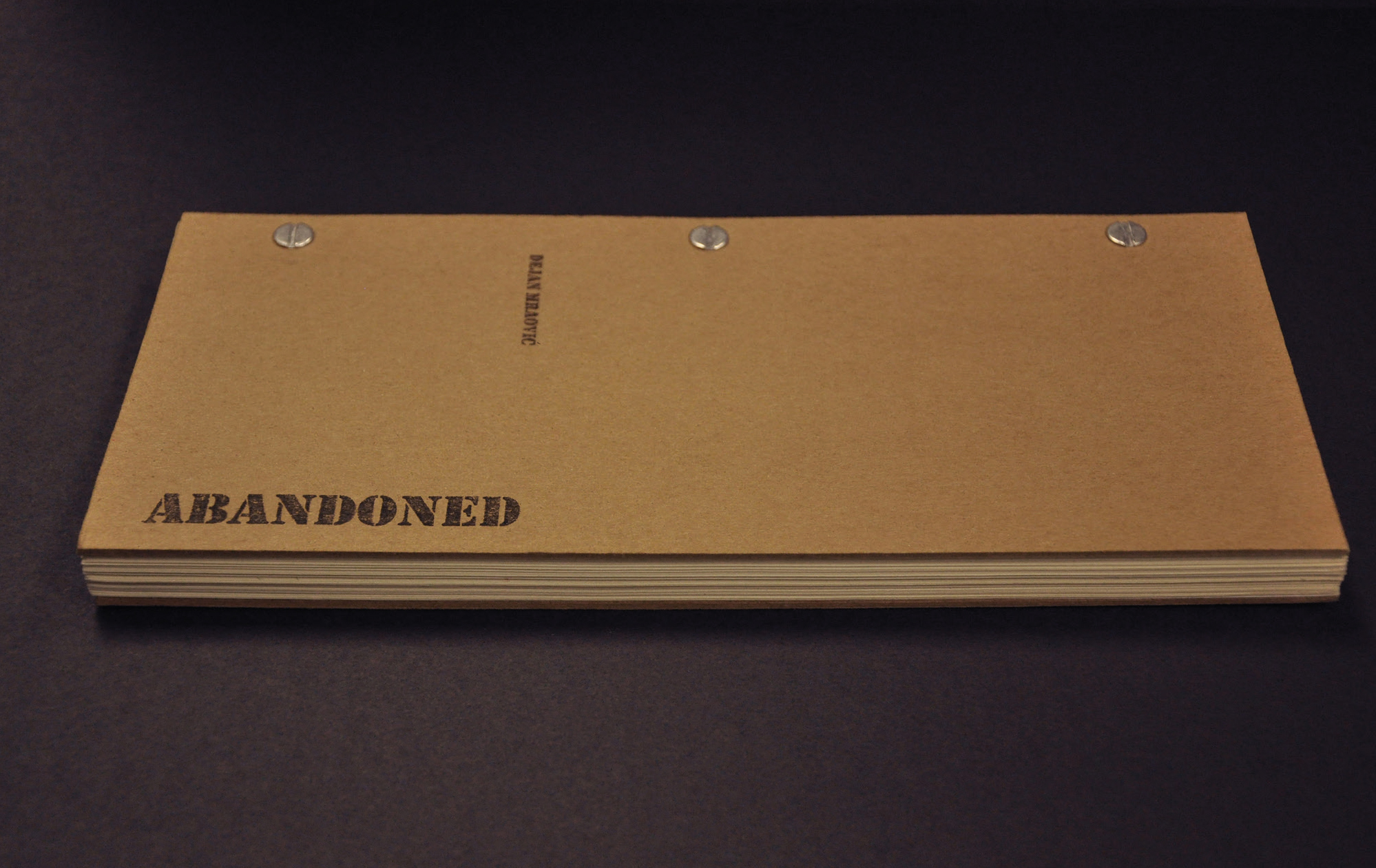
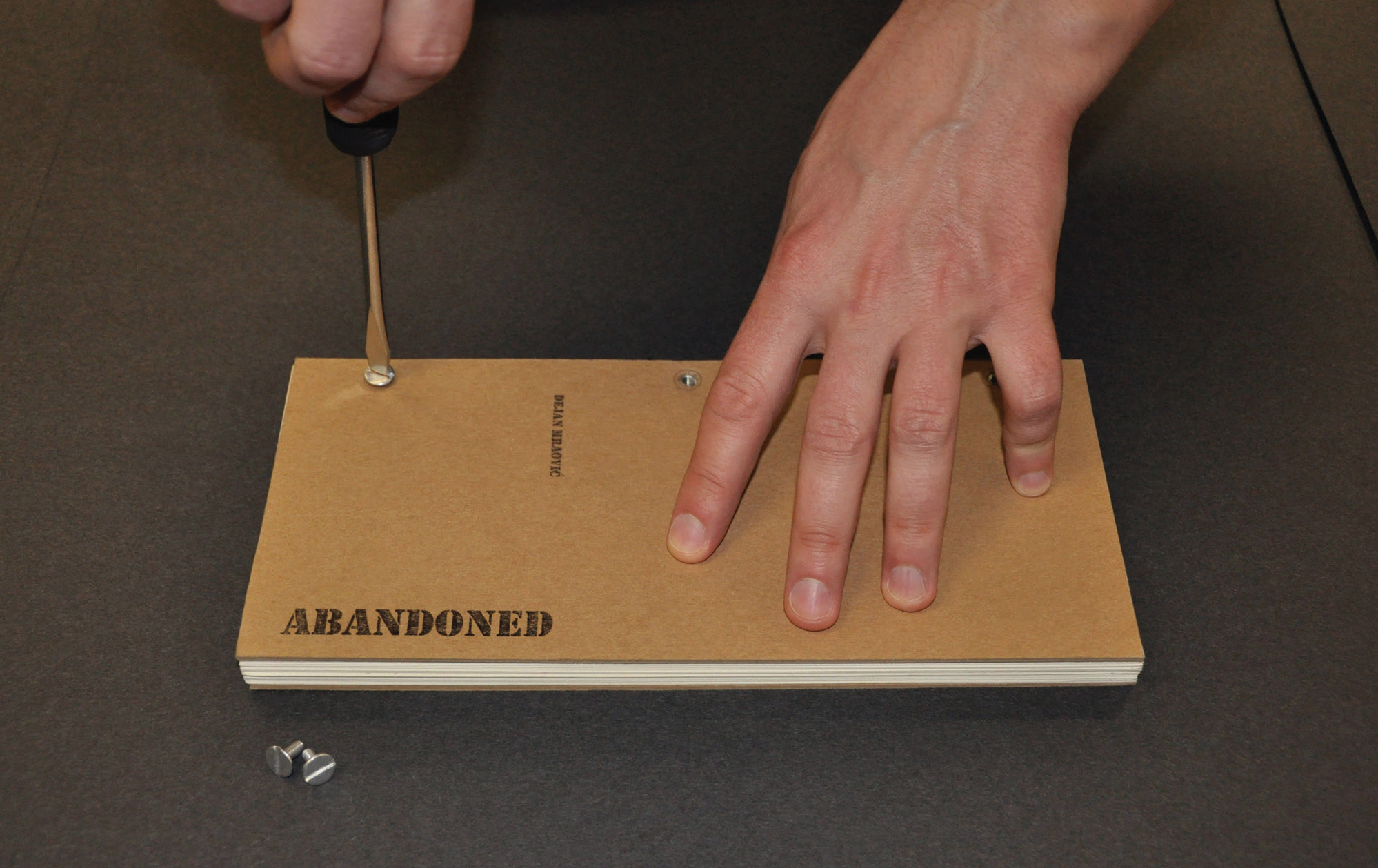
Entrance Only

Entrance Only
documentary photograph, 2012

This picture was made in the graveyard in Athens, Ohio.

2017: Selected for the Wichita Falls Art Association 4th Annual Photography Exhibition, Wichita Falls Art Association Gallery, Wichita Falls, Texas, USA

Serbiana, Latin and Cyrillic font

MFA Thesis – Graphic Ambassadors of a Country
Serbiana, sans-serif font, 2011-2012

Various denominations of Serbian money written numerically or alphabetically using my sans-serif font Serbiana: 10 dinars, 20 dinars, 50 dinars, 100 dinars, and 200 dinars. My goal in creating this composition was to see if the alphabetical and numerical characters inside of my typeface were harmonious and visually consistent.

2016: Presented during my typographic workshop at Southwestern Oklahoma State University, College of Arts and Sciences, Department of Art, Communication and Theatre, Weatherford, Oklahoma, USA

2017: Presented during my typographic workshop at Southern Arkansas University, College of Liberal and Performing Arts, Department of Art & Design, Magnolia, Arkansas, USA

Serbiana, Latin and Cyrillic font

MFA Thesis – Graphic Ambassadors of a Country
Serbiana, sans-serif font, 2011-2012

On this page I wanted to show the harmony and consistency of my font Serbiana. Whether the word is, (in this case word progress) written in English, or in Serbian, in Latin or in Cyrillic alphabet, the visual unity of my sans-serif font stays unchangeable.

2015: Presented during my typographic presentation at Ohio University, College of Fine Arts, School of Art + Design, Athens, Ohio, USA

2015: Presented during my typographic presentation at Emporia State University, College of Liberal Arts & Sciences, Department of Art, Emporia, Kansas, USA

2015: Published on SEEcult, Belgrade, Serbia (an online magazine for the culture of Southeastern Europe)

2015: Serbiana was presented on Designed, Belgrade, Serbia (an online magazine for design)

Serbiana, sans-serif font

MFA Thesis – Graphic Ambassadors of a Country
Serbiana, sans-serif font, pangram, 2011-2012

As a measure of protection for my currency, I designed a completely new, sans-serif font Serbiana. Serbian is the only language in the world that uses both the Latin and Cyrillic alphabet; I worked on both alphabets in this project. I believe that this unique, brand-new font contributes to the originality and beauty of my redesigned banknotes.

2013: The font was used by Ohio University Communications and Marketing for the new branding commercials in academic year 2013/14. Serbiana was applied on Ohio University’s web site, T-shirts, catalogs, flyers, and badges.

2014: Presented during my typographic presentation at the Consulate General of the Republic of Serbia, Manhattan, New York City, New York, USA

2014: Presented during my typographic presentation at the Parish Hall of the Serbian Orthodox Cathedral of Saint Sava, Manhattan, New York City, New York, USA

Homage to Typography on the Serbian and Yugoslav Banknotes

Homage to Typography on the Serbian and Yugoslav Banknotes
digital collages, 2012

These two compositions are my homage to typography of Serbian and Yugoslav dinars. Numerous typefaces (titles and denominations) were taken from the various banknotes from different time periods of my country: Principality, Kingdom, Republic; Democracy, Communism, Socialism, Democracy. Composition which is darker symbolizes obverses on the banknotes, while the next, brighter collage represents their reverses. All the scanned paper money that I used for these two digital collages are courtesy of the Treasury of the National Bank of Serbia in Belgrade.

2012: Published in The Post, Athens, Ohio, USA (Ohio University’s newspaper)

2013: Published on Pogledaj.to, Zagreb, Croatia (an online magazine for design and architecture)

2013: Published in IdN, Hong Kong, China (design magazine)

Historic Overview of the Previous Designs of Money in Serbia and Yugoslavia

MFA Thesis – Graphic Ambassadors of a Country
historic overview of the previous designs of money in Serbia and Yugoslavia, 2011-2012

My thesis research focused on money and redesign of the Serbian national currency – the dinar. I consider banknotes and coins ambassadors of every country because on them one can read about a country’s culture, history, and nature. This thesis was made in collaboration with the National Bank of Serbia in Belgrade. Since I wanted to better understand the previous designs of money in Serbia and Yugoslavia, I also wrote a historic overview in collaboration with the Serbian Academy of Sciences and Arts, Belgrade, the National Museum, Belgrade, the Museum of Vojvodina, Novi Sad, Serbia, the National Museum, Niš, Serbia, the Museum of Srem, Sremska Mitrovica, Serbia, the National Museum, Požarevac, Serbia, the City Museum of Vršac, Vršac, Serbia, the Nikola Tesla Museum, Belgrade, the Museum of Herzegovina, Trebinje, Bosnia and Herzegovina, the Museum of Kozara, Prijedor, Bosnia and Herzegovina, the Regional Museum, Doboj, Bosnia and Herzegovina, and the Regional Museum, Gradiška, Bosnia and Herzegovina. My thesis was exhibited at the Ohio University Art Gallery in Athens, Ohio in 2012. The more developed versions of the project were shown in 2013 at the Omega Gallery, Carson-Newman University, Jefferson City, Tennessee, and at the Sleeth Gallery, West Virginia Wesleyan College, Buckhannon, West Virginia in 2017.

Protection

Protection
pictograms, self-promotion, 2010

These pictograms promote workplace safety through the use of a hard hat. A construction helmet will save anything beneath it.

2012: Published in UrbanStyleMag, No. 28, Mytilene, Lesbos, Greece (art & urban culture magazine)

2013: Campbellsville University Annual Art Faculty Exhibition, Campbellsville University, Pence-Chowning Art Gallery, Campbellsville, Kentucky, USA

Rocky the Boss

Rocky the Boss
short film, comedy, 2010

This film is a parody on the Rocky Balboa movies. Filmed in Athens, Ohio, USA.

screenplay, leading actor, editing, director, producer: Dejan Mraović

photography, cameraman: Christopher Luessen

supporting actor: Jenna Verhoff

2011: Official Selection of the 38th Athens International Film + Video Festival, Athena Cinema, Ohio University, Athens, Ohio, USA

2012: Official Selection of the 12th Dhaka International Film Festival, (film biennial), Bangladesh National Museum, Dhaka, Bangladesh

2013: Official Selection of the 5th Winter Shorts Film Festival, Stoner Little Theatre, Somerset Community College, Somerset, Kentucky, USA

Bicycle

Bicycle
short film, comedy, 2010

This is a short story about one very impatient man. Filmed in Athens, Ohio, USA.

screenplay, leading actor, editing, director, producer: Dejan Mraović

supporting actor, cameraman, sound: Christopher Luessen

photography: Dejan Mraović & Christopher Luessen

2010: Official Selection of the 4th Riverside Saginaw Film Festival, The Temple Theatre, Saginaw, Michigan, USA

2011: Official Selection of the 14th Green Mountain Film Festival, Pavilion Auditorium, Montpelier, Vermont, USA

2011: Official Selection of the 38th Athens International Film + Video Festival, Athena Cinema, Ohio University, Athens, Ohio, USA

2011: Official Selection of the 6th International Cycling Film Festival, Flottmann-Hallen Theatre, Herne, Germany

Abandoned

Abandoned
artist’s book, 2010

This artist’s book is inspired by the tragic dissolution of the former Yugoslavia, the Yugoslav Wars (1991-1995), and the economic depression caused by the political chaos. During that time, common people grew drastically poor, while the aggressive politicians and their families got rich. National currencies lost their value and meaning, causing the disaster of the banking sector, so everybody saved German marks, Swiss francs or American dollars in secret places such as drawers, tills and mattresses. Some people even used to cut holes in the text blocks of books and kept their money for the insecure days there. Nobody believed in the banks especially in Serbia when hyperinflation reached its zenith in 1993. The biggest banknote from that period was for 500,000,000,000 (five hundred billion) dinars. Sadly, everybody was a millionaire, or ironically a billionaire, but in fact without a penny in his/her pocket. For one month’s salary my mother, who was a professor of Serbian, could buy one egg! Galloping hyperinflation killed the Serbian currency and market. My book reminds us of that sad period of recent history in order to never forget how common people lived there in those difficult times. It also represents a warning for every hot-blooded person who thinks that civil war is something necessary and romantic. I have been writing and publishing aphorisms, jokes, and satires in Serbian daily and satirical newspapers since 1999. Abandoned combines my sense of humor with my graphic design and bookbinding skills. The pages are taken from an old typographic catalogue and represent all kind of typefaces. The secret compartment is designed to keep a lot of banknotes, but there is only one $1 US bill to symbolize the poverty of those days. Using proportions from the US dollar, I made the rectangular hole with a scalpel. On the bottom of the secret compartment is a light green paper which symbolizes the color of American money. But instead of a stash of precious dollars resistant to wild hyperinflation, there is a triptych hidden behind that one dollar bill – a picture of three malicious dictators: Franjo Tuđman, Alija Izetbegović and Slobodan Milošević. Their portraits are with smiles, but those smiles represent the real nature of their characters – evilness and greed. These are people who cannot even laugh naturally without grimaces. On the triptych which I made in Adobe Photoshop, I wrote the text in Serbian and Croatian (Serbo-Croatian): SVE SMO VAM UZELI! Translated into English, that text means: WE TOOK ALL (FROM YOU)! The cover of the book is made of thick ochre cardboard so the book looks more like a real wooden box. Abandoned is bound by three screws in order not to be opened – I don’t want anybody to take my money from the secret stash. The screws are connected with English word screw because those wild politicians screwed us during the 1990s and we still suffer because of their horrible mistakes. The name Abandoned evolved from a mind-map process. It is related to the main feeling of my whole generation: we are penniless and without a future. I used the font Stencil to manually print the title. This typeface is common for boxes and packages. Abandoned is included in the permanent collection of artistic books at the Archives and Special Collections Vernon R. Alden Library, Ohio University, Athens, Ohio, USA.

2013: Published in Font, No. 130, Prague, Czechia (typographic magazine)

2014: Published on Muyricotodo, Buenos Aires, Argentina (an online magazine for art and design)

2014: Published on Vizkultura, Zagreb, Croatia (an online magazine for the visual arts)

2014: Presented at Campbellsville University, College of Arts & Sciences, Department of Art and Design, Campbellsville, Kentucky, USA

Jeans

Jeans
bookbinding, 2010

This is an example of my bookbinding skills. I used denim from a pair of my old jeans. This material is unusual in bookbinding.

Everything in My Head at this Moment

Everything in My Head at this Moment
artist’s book, 2010

Humor is very often present in my artwork. On this page, you can see two manually produced books from the series Everything in My Head at this Moment. The viewer expects that these books are full of my thoughts and ideas but, in fact, the pages are completely blank. In that way, I wanted to make a joke. The simple black cover page strengthens the “reader’s” attention to the empty pages of this “book.”

Aphoristic Greeting Card

Aphoristic Greeting Card
a typographic artwork, 2010

I manually printed this typographic piece at a letterpress studio at Ohio University in Athens, Ohio. I am also the author of the aphorism that is printed on the card. The Aphoristic Greeting Card has green, “watery” letters, which are related with the seawater from the joke. This work stems from my aphorisms and jokes that were published in satirical and daily newspapers in Belgrade, Serbia: Jež, Naša Krmača, Politika, and Borba.

2012: Selected for the 16th Exhibition of the Most Beautiful Calendars and Christmas Cards, Museum of Contemporary Art of Vojvodina, Novi Sad, Serbia

2012: Published in the catalogue of 16th Exhibition of the Most Beautiful Calendars and Christmas Cards, Museum of Contemporary Art of Vojvodina, Novi Sad, Serbia

2012: Published on Designed, Belgrade, Serbia (an online magazine for design)

No Money, No Food!

No Money, No Food!
a typographic artwork, 2010

This typographic composition expresses my taught about void. I deliberately erased several O’s from the text. With its circular shape, the letter O symbolizes a coin. The absence of the letter O in the word money represents a lack of financial stability. Without money in your pocket, you cannot buy any food. The penniless artist cannot be very creative and that is why the letters are black and simple. The lack of financial security causes the absence of inspiration.

2011: Selected for the 2nd International Exhibition Art in Miniature, Cultural Center of Majdanpek, Majdanpek, Serbia

2011: Published in the book of the 2nd International Exhibition Art in Miniature, Cultural Center of Majdanpek, Majdanpek, Serbia

2011: Published on Designed, Belgrade, Serbia (an online magazine for design)

Chroma

Chroma
book, 2010

Chroma is the result of my color and theoretical research. I concentrated on brown and ocher because in those colors are incorporated other colors: yellow, orange, red and black. Brown and ocher are all around us: soil, rocks, sand, fall, baked meat, nuts, coffee, chocolate… Using these powerful colors, I wanted to show all the possibilities of gradients and shades. Through numerous abstract compositions, I explored alignment, repetition, chiaroscuro, harmony, contrast, convex and concave shapes. I was interested in exploring color phenomena through geometry, patterns, and grids, so this book is a logical continuance of work that I presented in my first book, The Grid. The basic element of all these brown compositions is a column consisting of twelve irregular polygons. From the bottom to the top of the column, each polygon becomes brighter. I originally painted it with brush and tempera on paper, and then I scanned that piece and imported it into Adobe Photoshop.

2012: Published on Designed, Belgrade, Serbia (an online magazine for design)

2012: Published in UrbanStyleMag, No. 24, Mytilene, Lesbos, Greece (art & urban culture magazine)

Color Explorations in Value

Color Explorations in Value
first image: tempera on paper, 2000
second and third composition: digital art, 2010

Value is used to make the illusion of light. The value is lightness or darkness of a color. To make a gradient with ten different color values, is a class assignment required in every art school in the world. That exercise helps to understand the color theory. Using the brush and tempera, I made eighteen different values of blue. Instead of simple squares, I used “arrows” for my steps. These pointed shapes additionally emphasize the gradual change of blue from the bottom to the top showing the shades (the dark values) and the tints (the light values). (A shade is a mixture of a color with black, while a tint is a mixture with white.) The highlights and shadows create the illusion of light source. The next two compositions were created on the computer. I scanned the paper with my gradient and imported it into Adobe Photoshop, where I played with position and direction of the color bars.

The Grid

The Grid
book, 2009

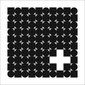
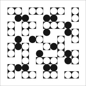
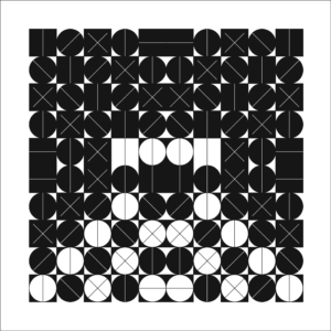
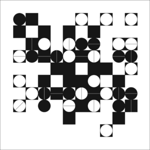
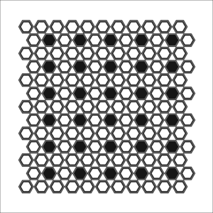
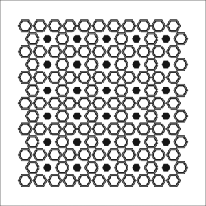
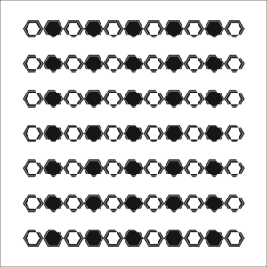
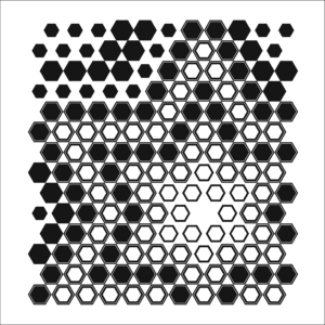
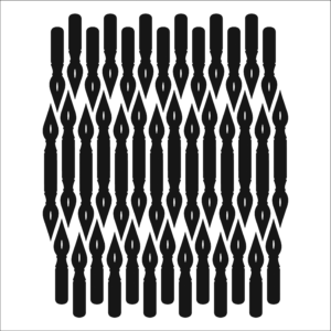
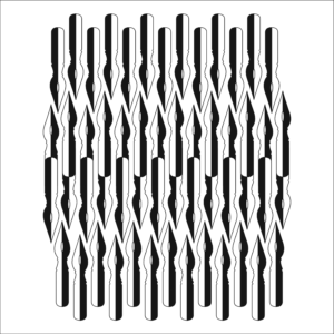
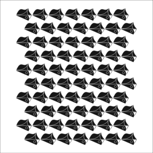
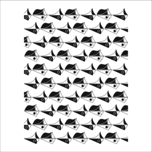
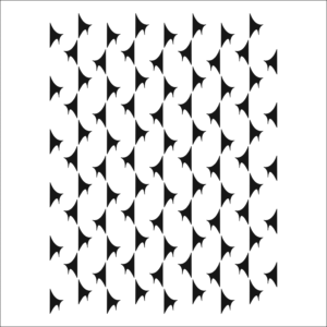
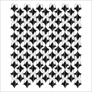
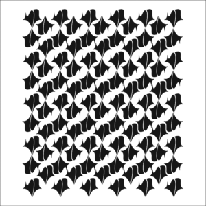
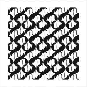
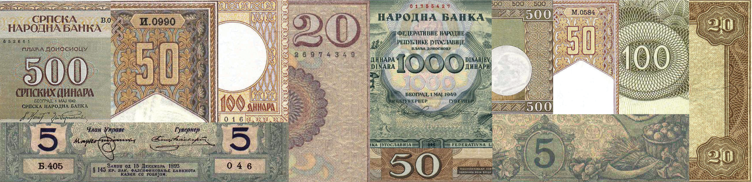
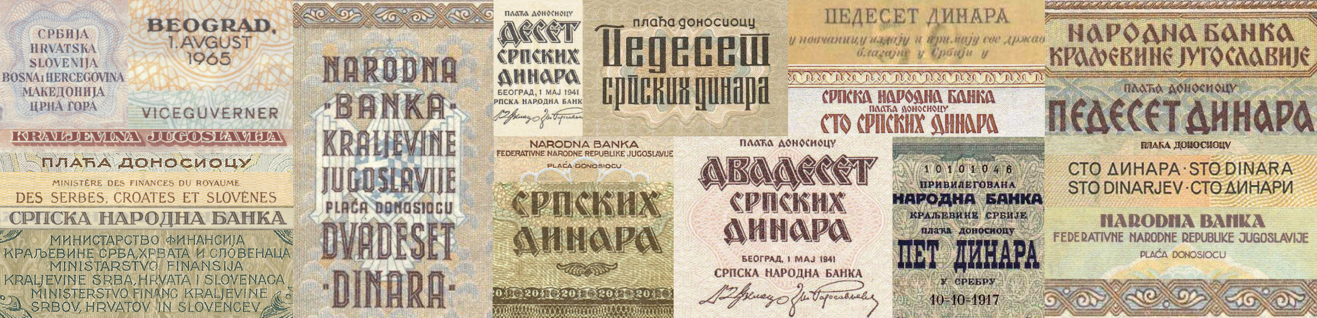
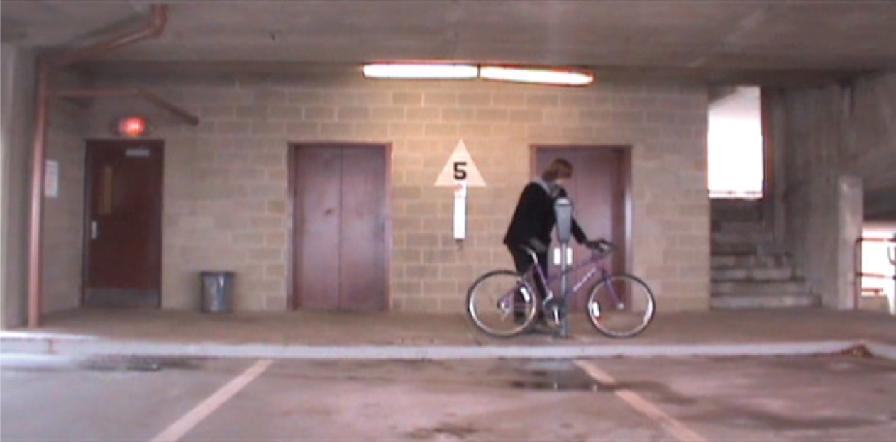
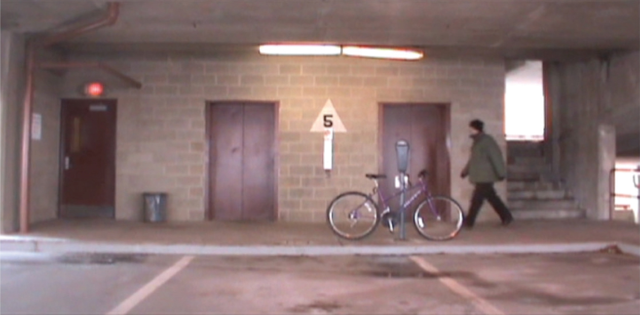
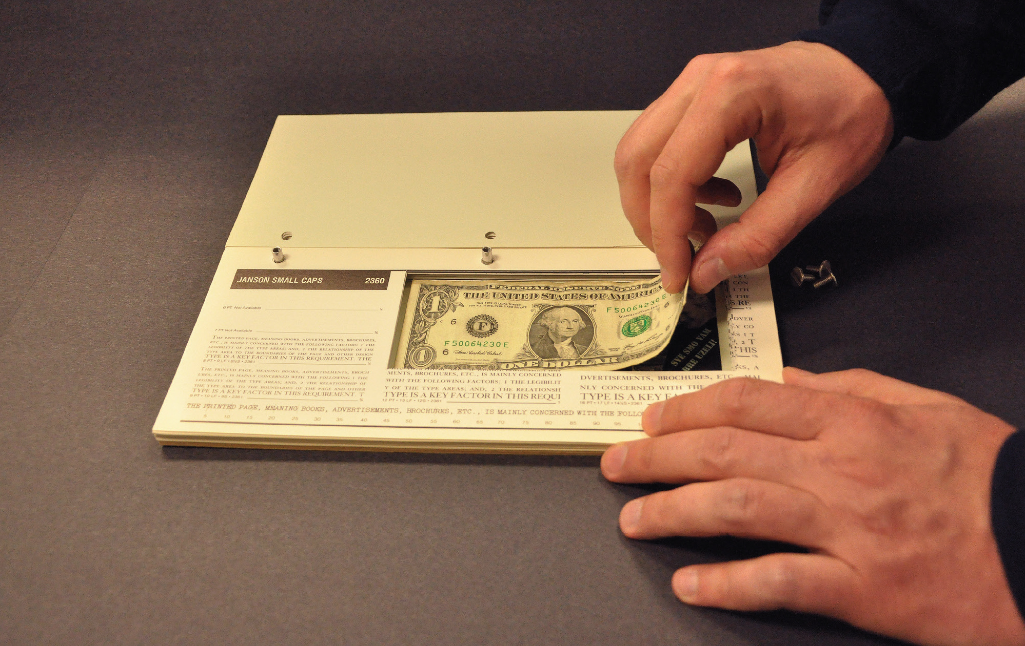
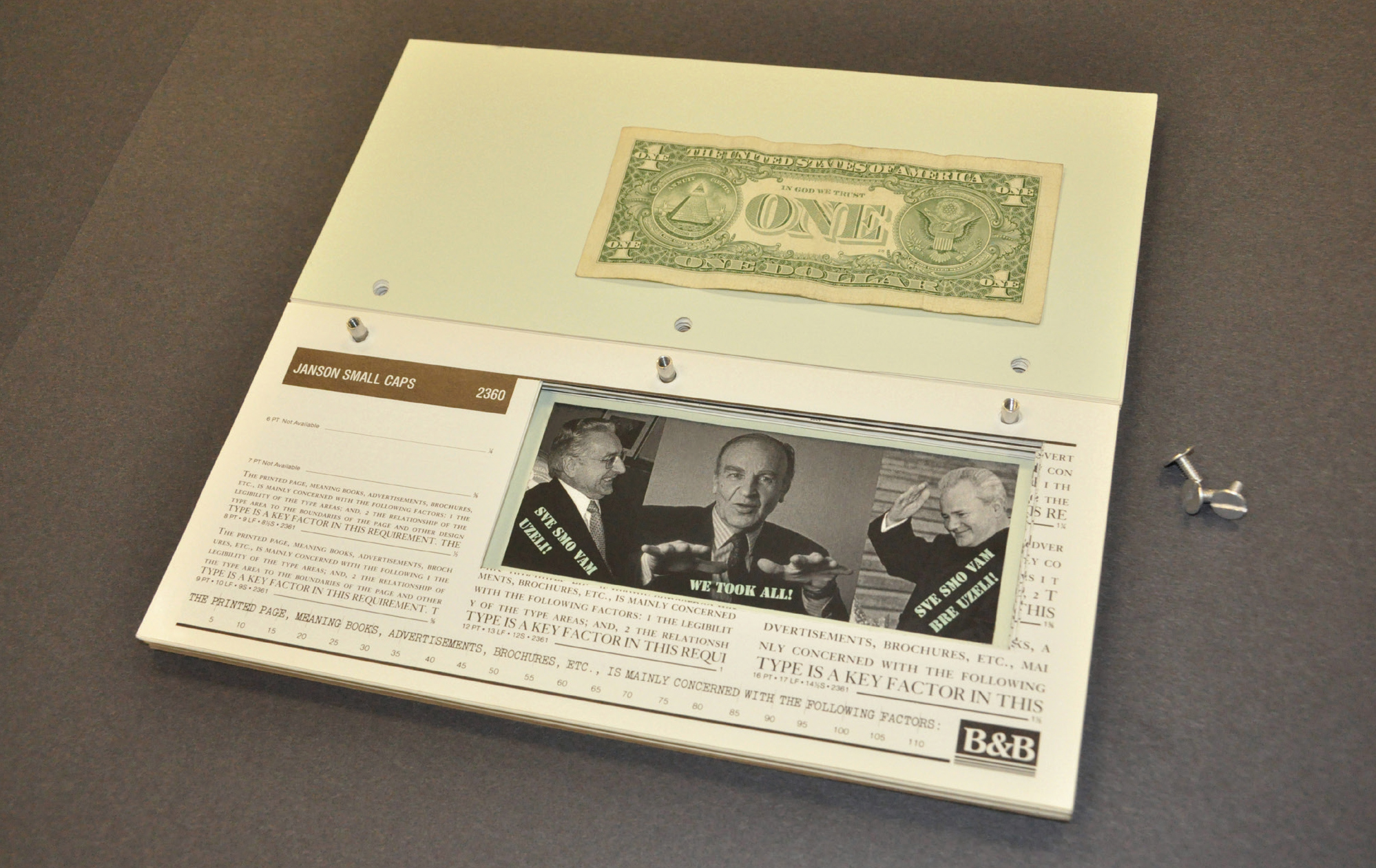
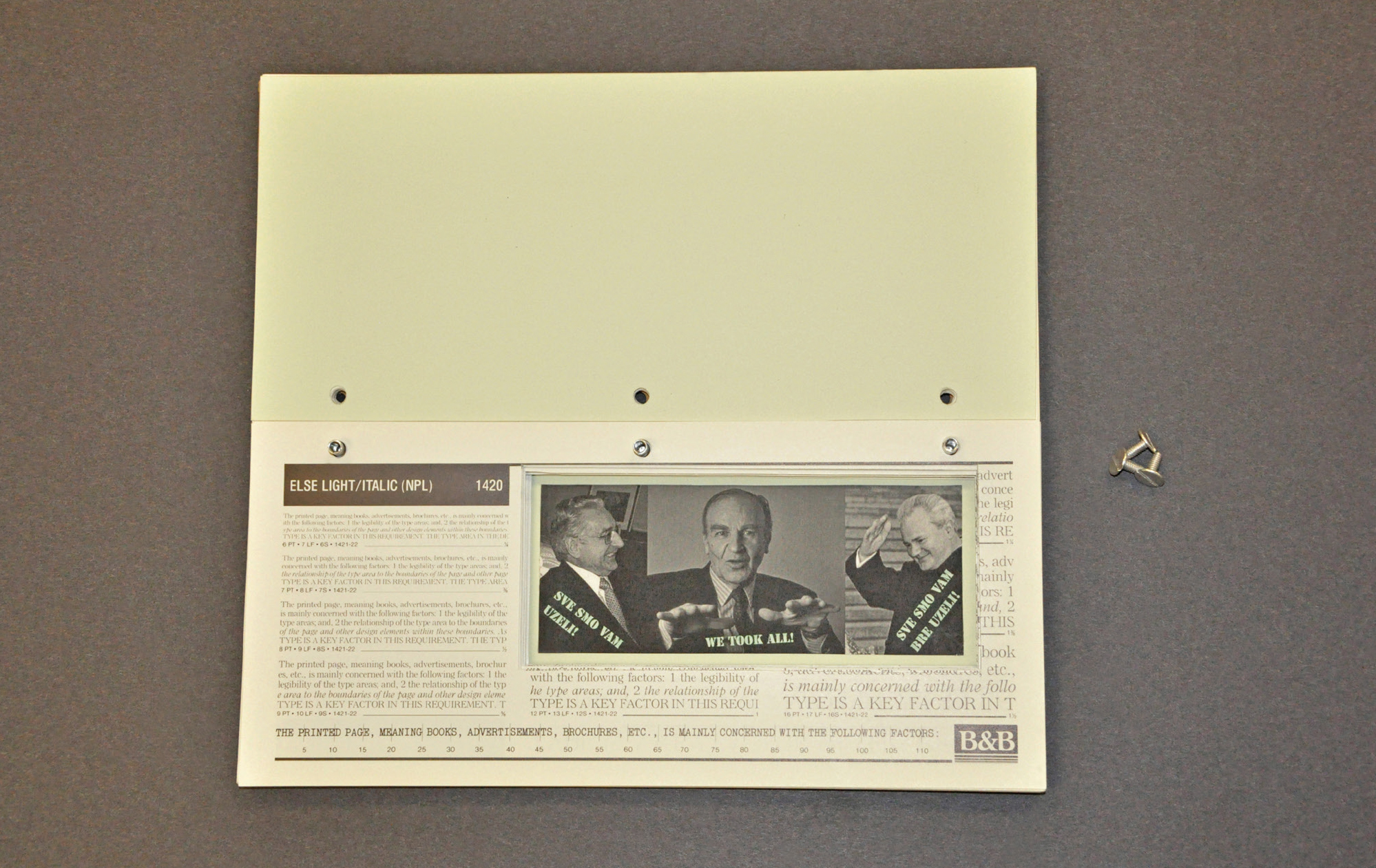
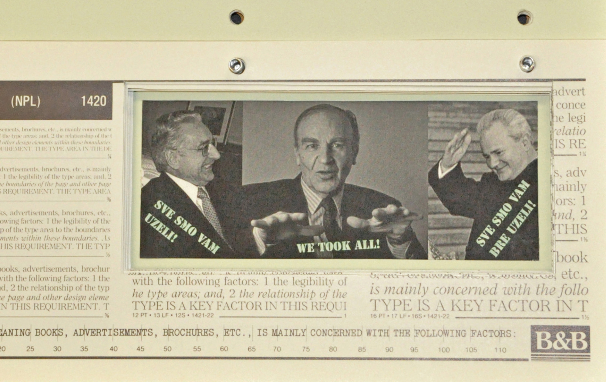
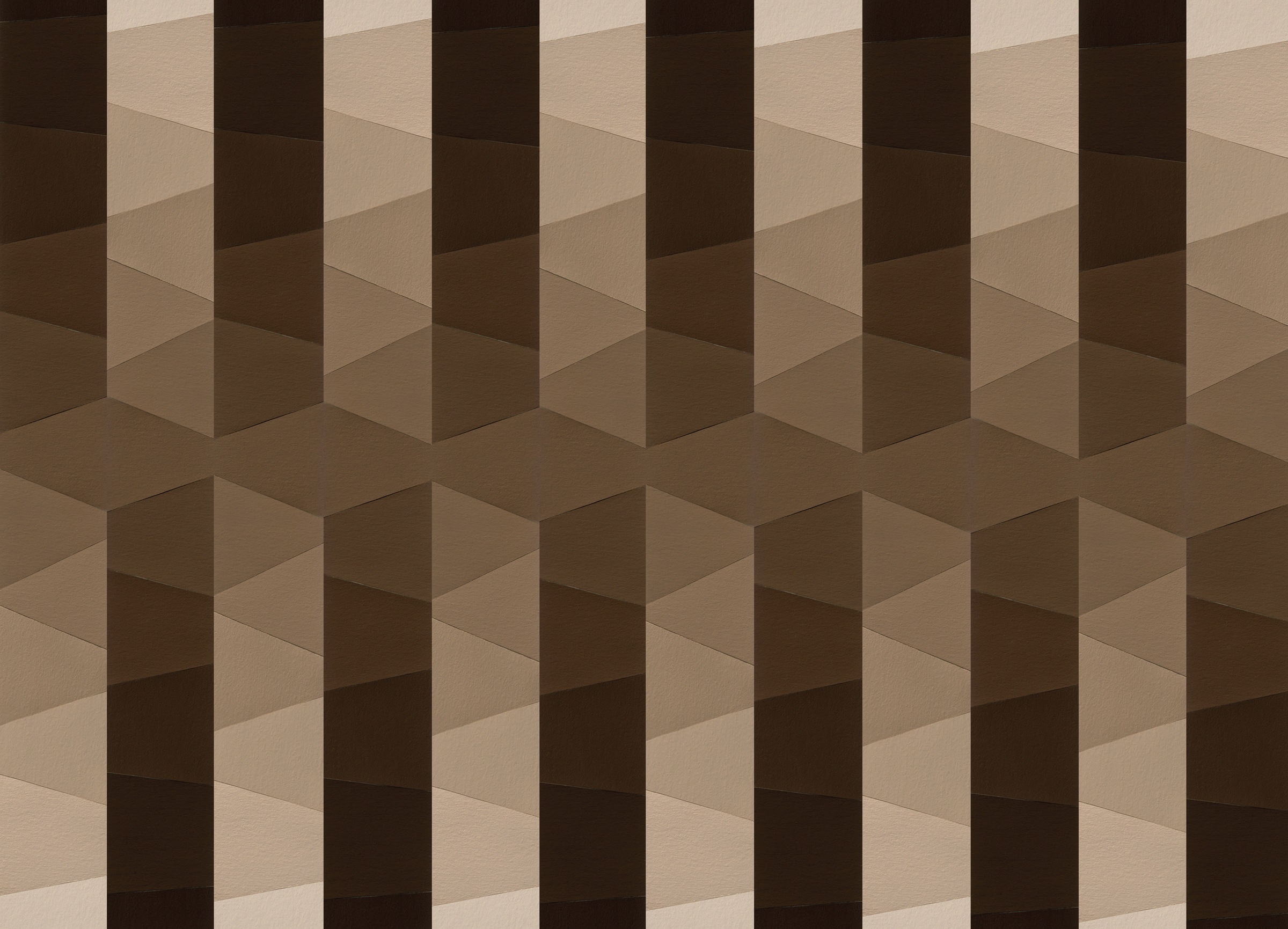
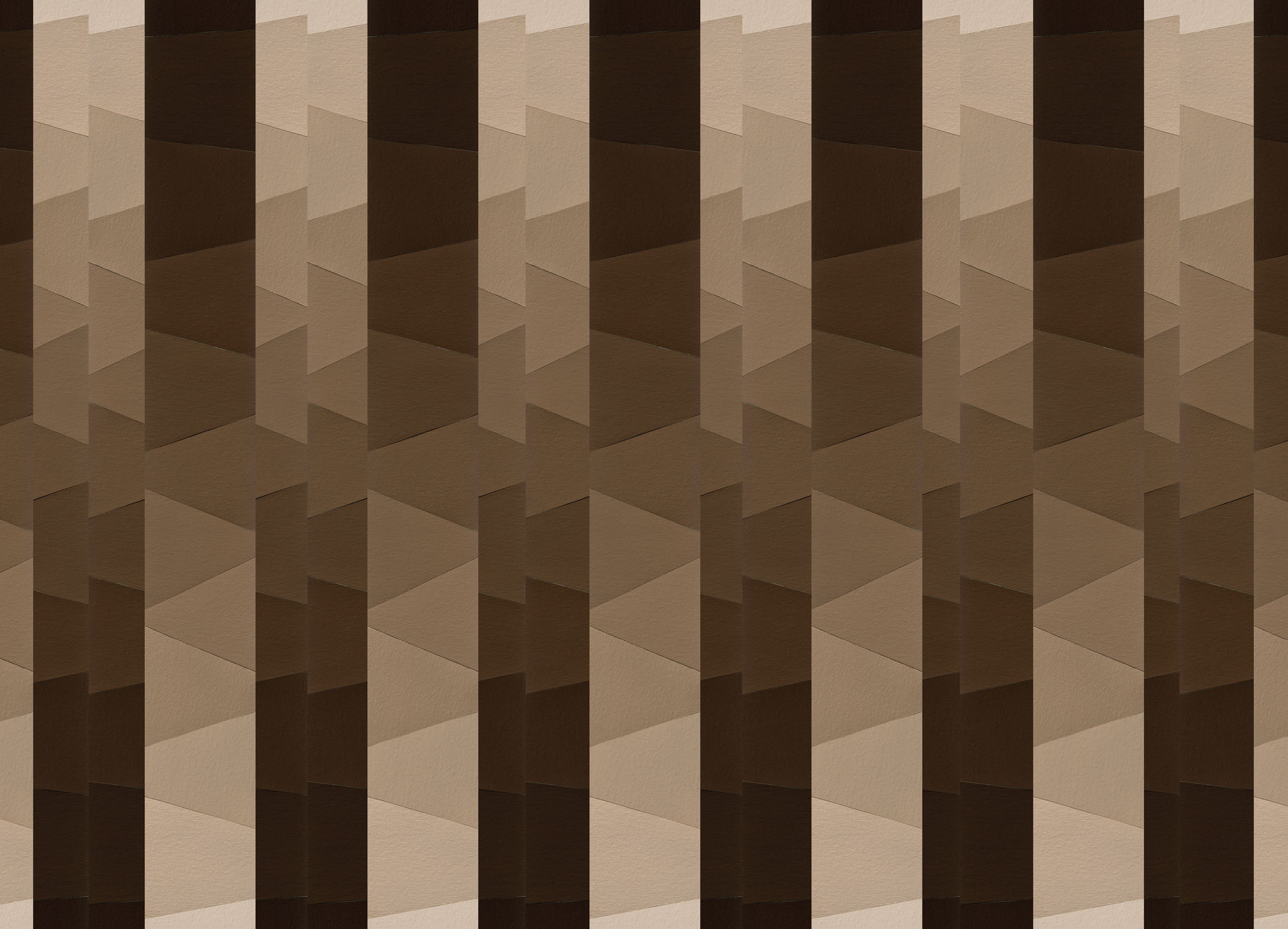
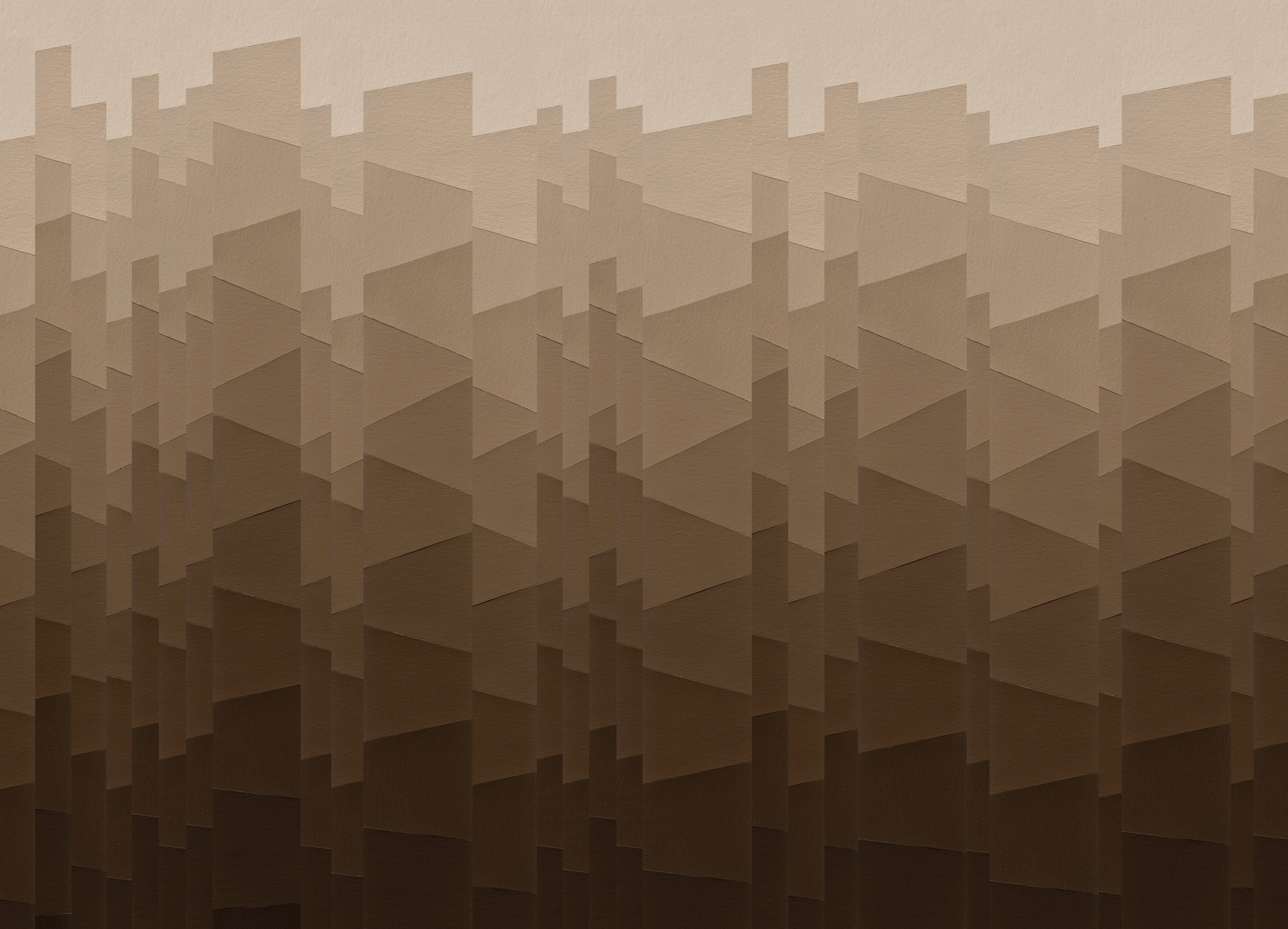
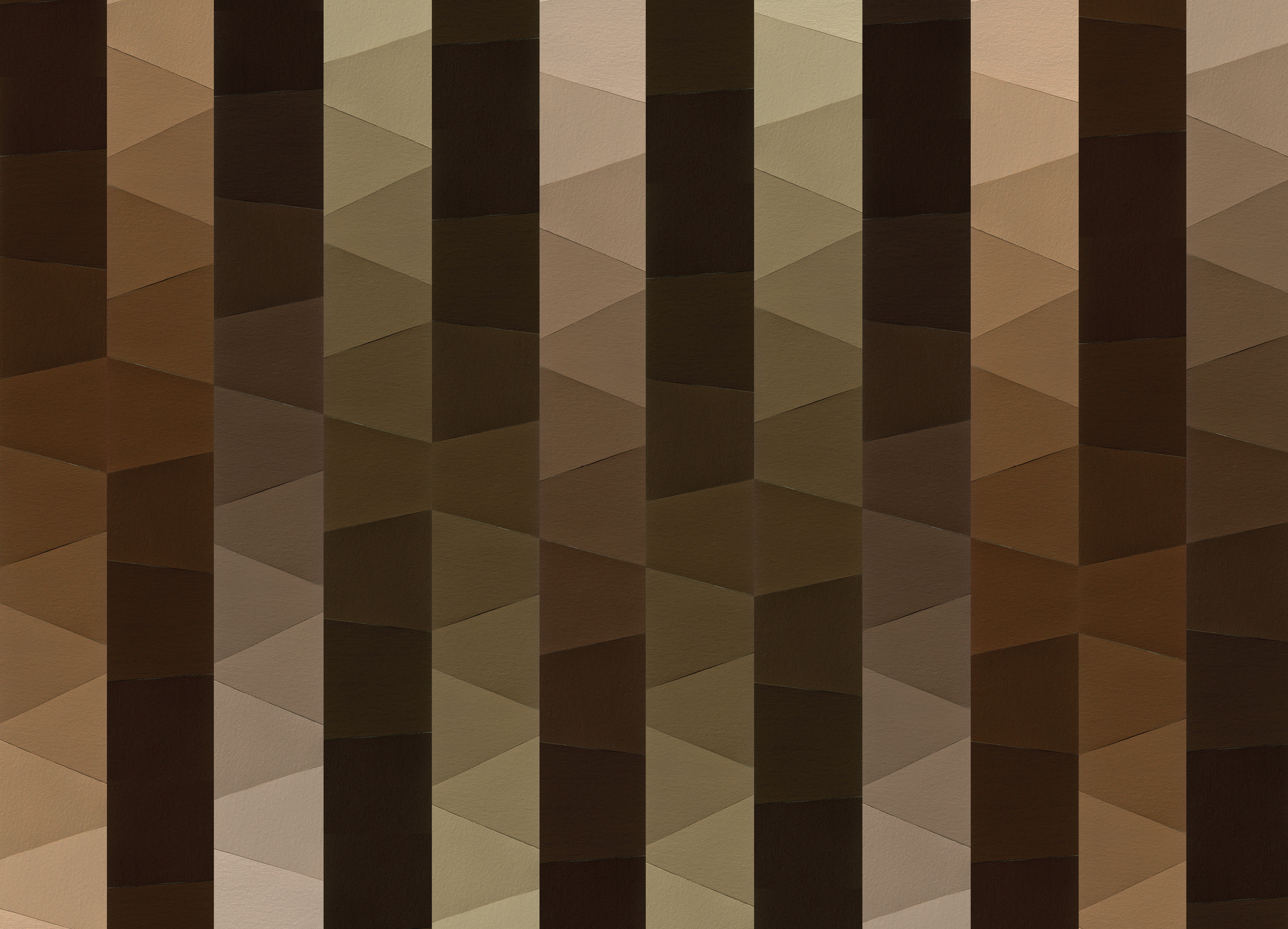
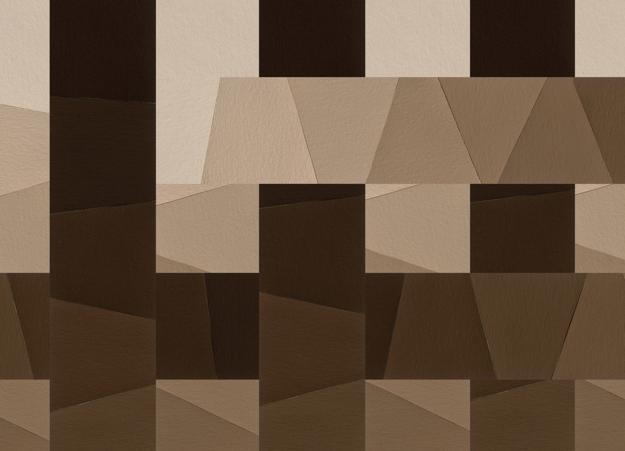
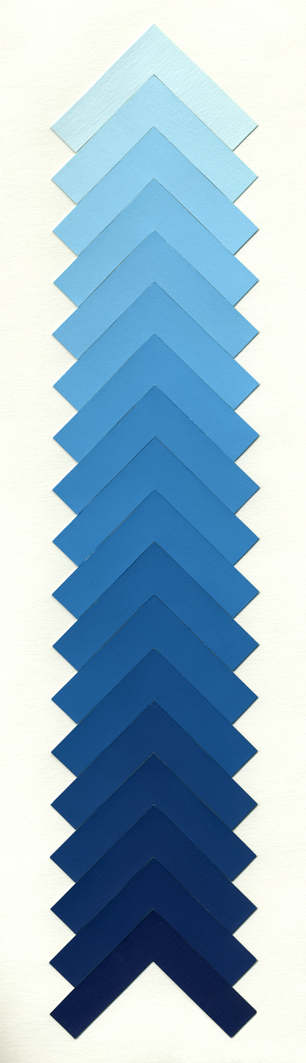
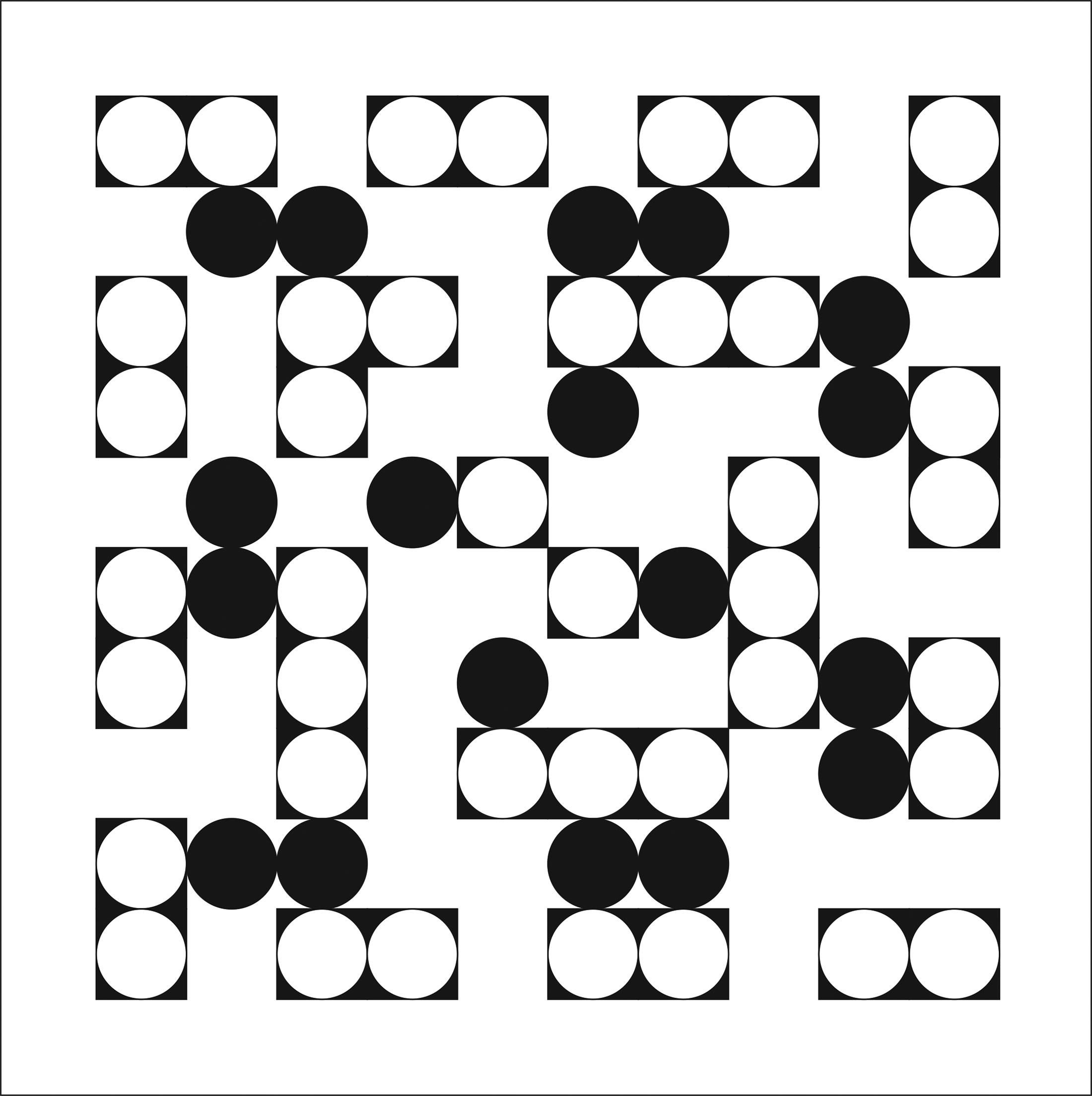
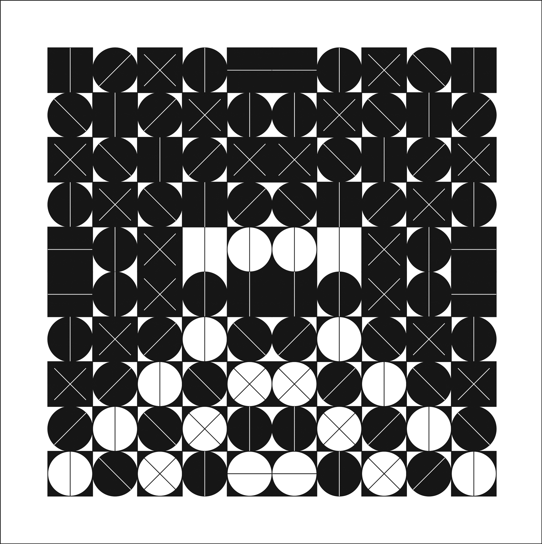
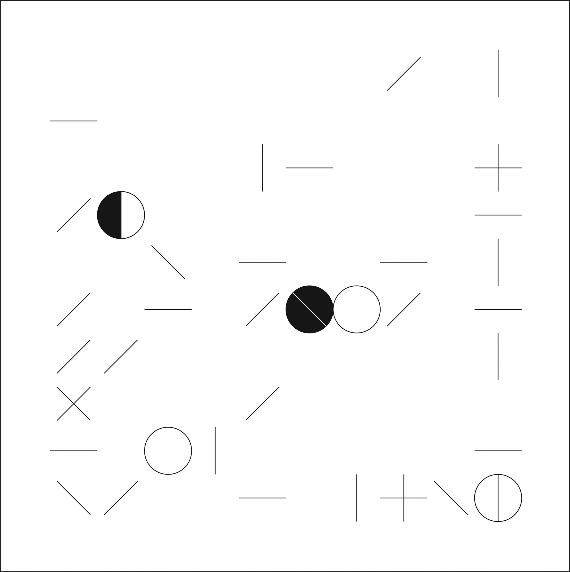
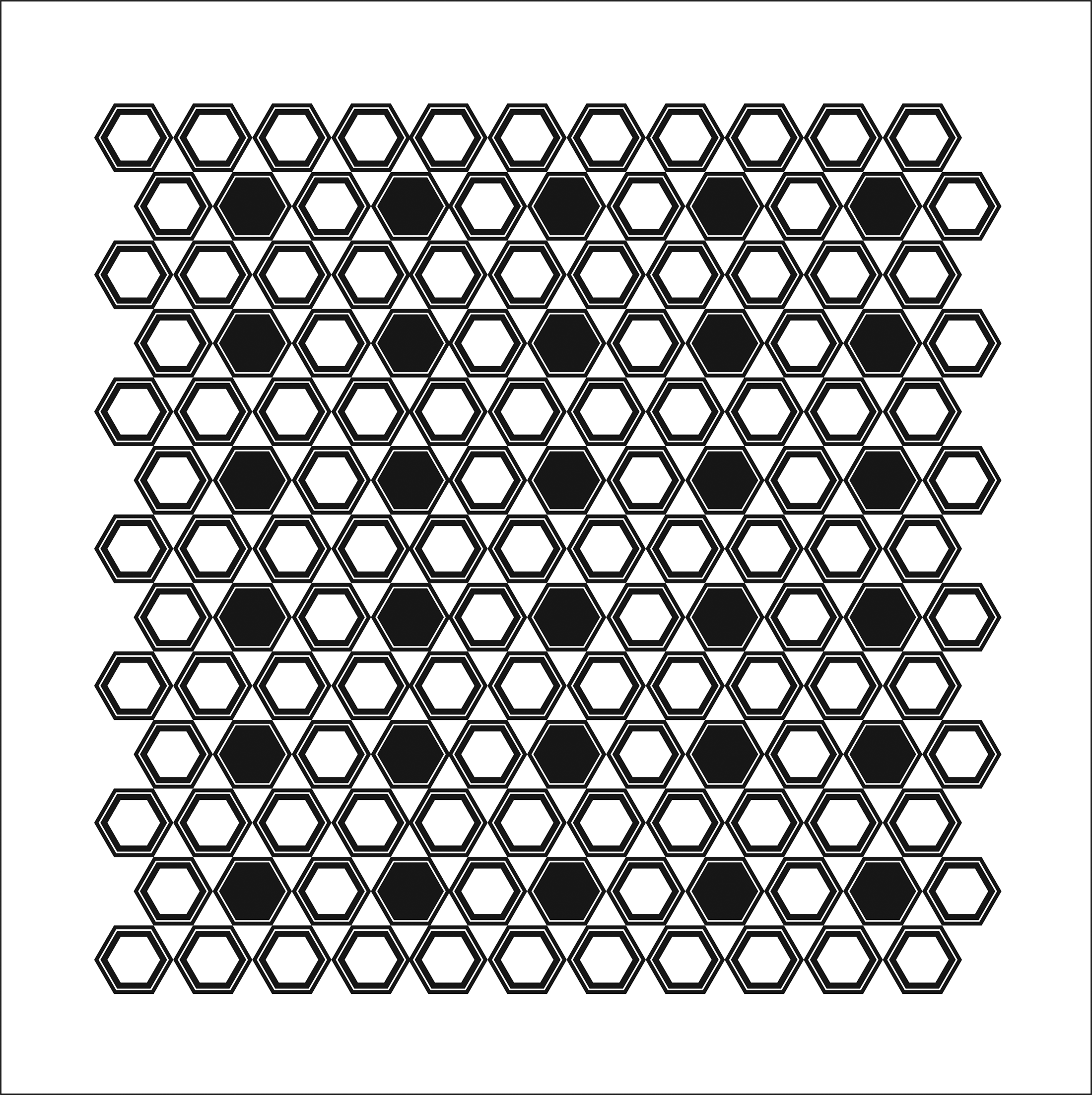
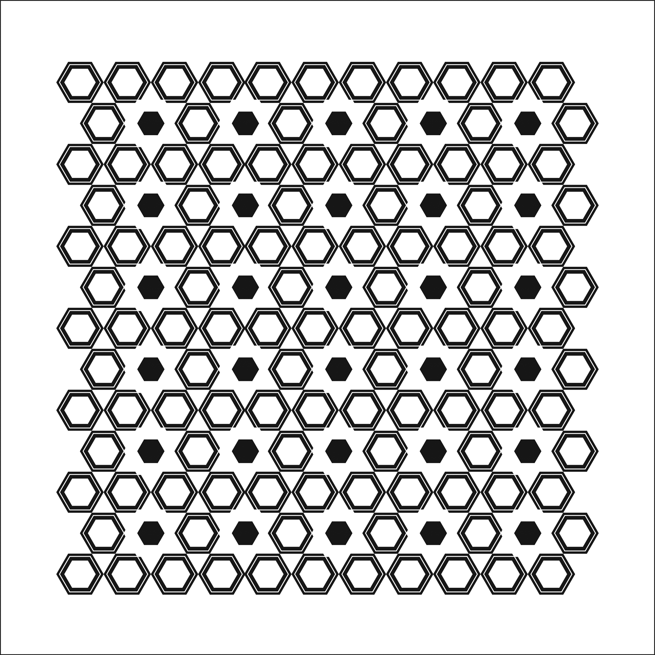
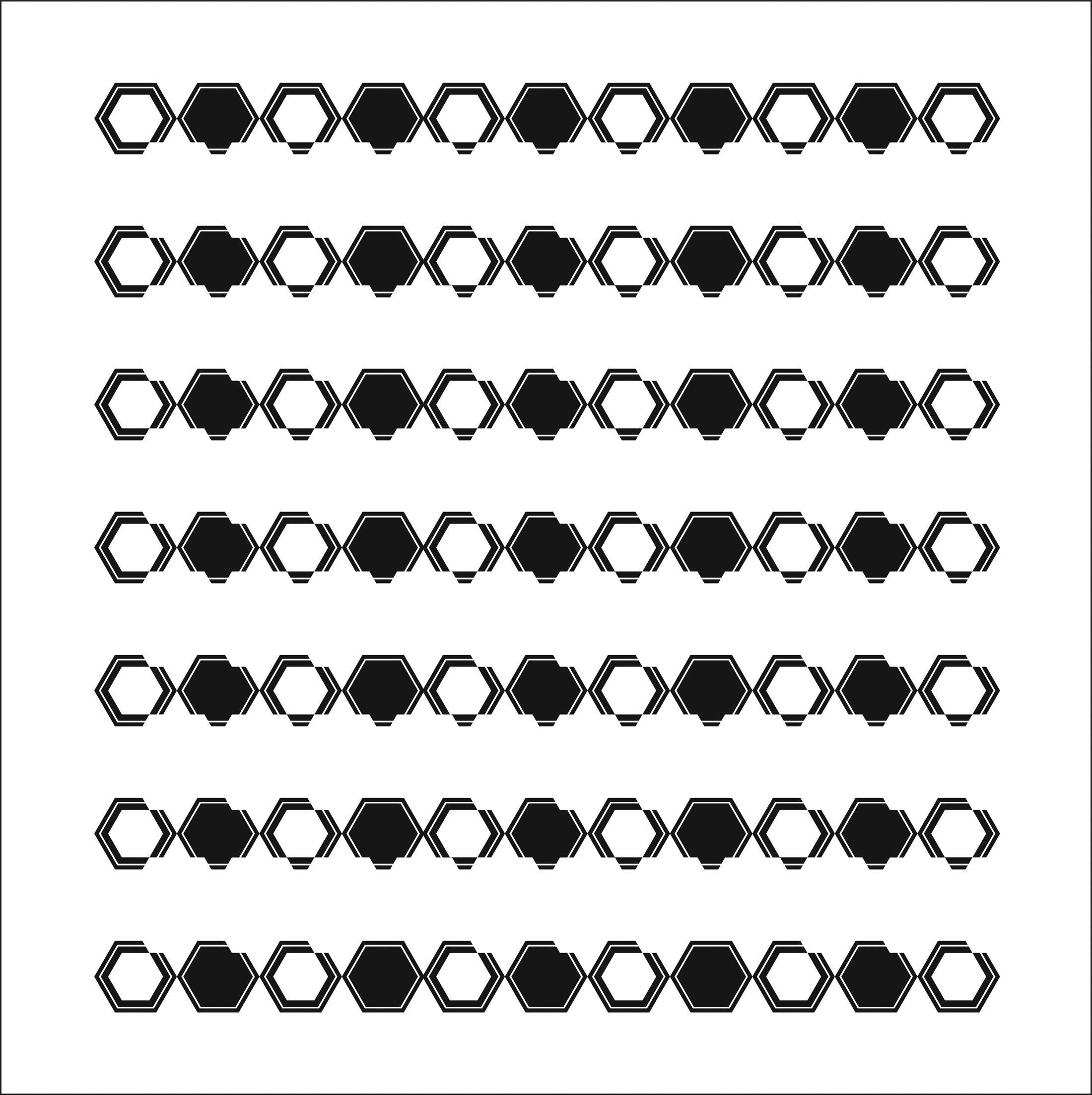
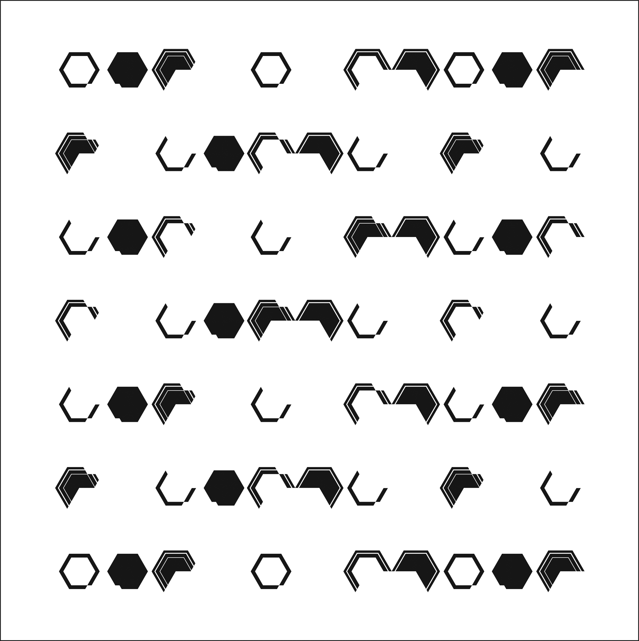
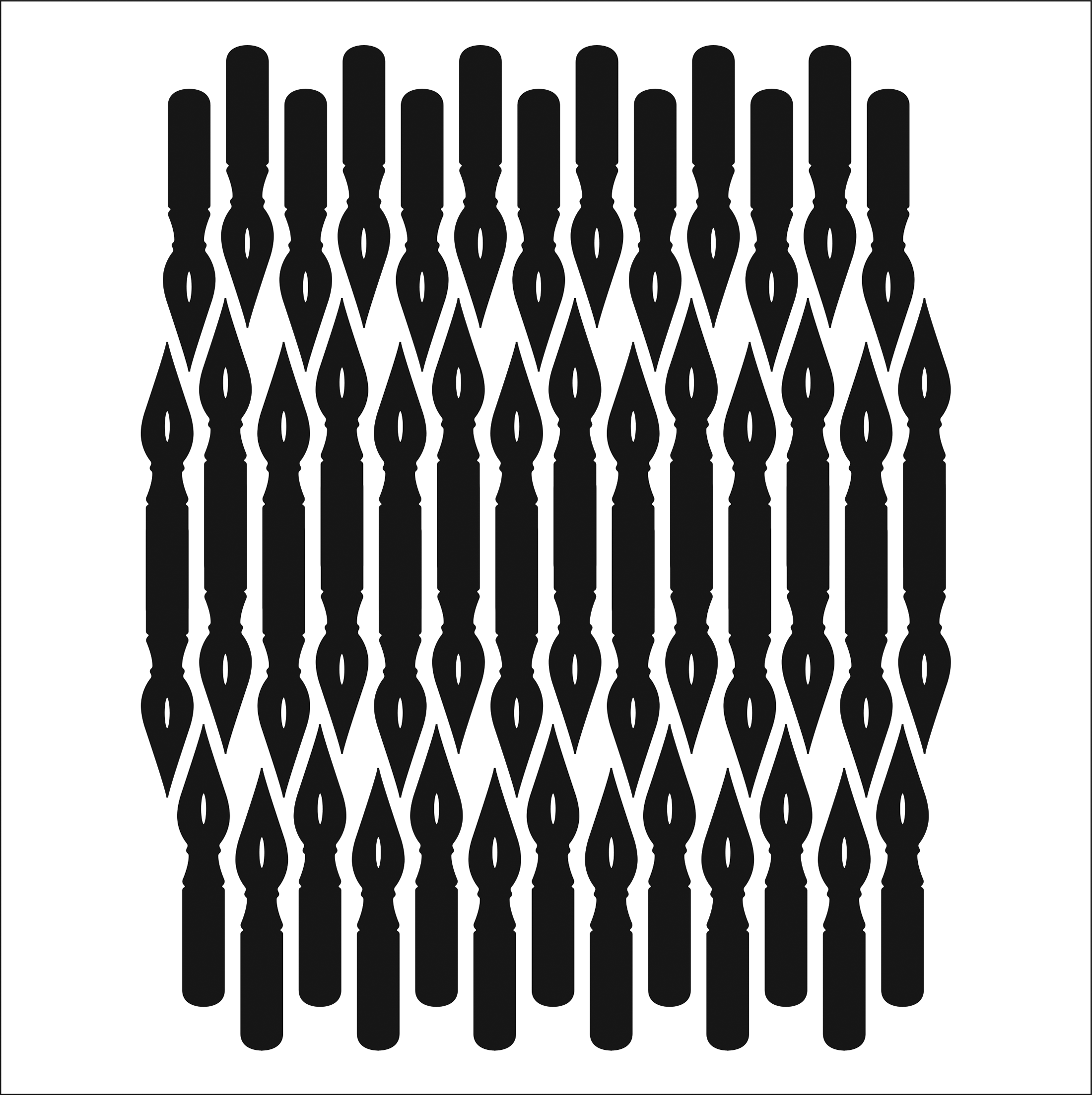
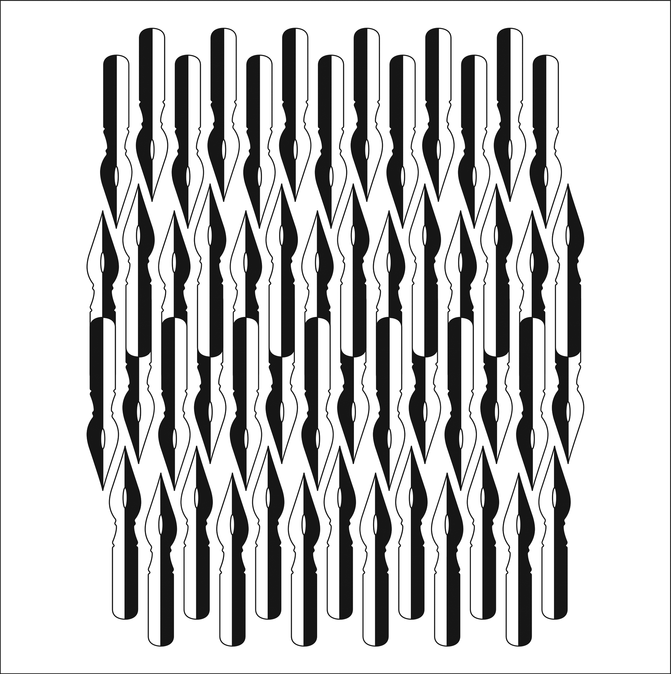
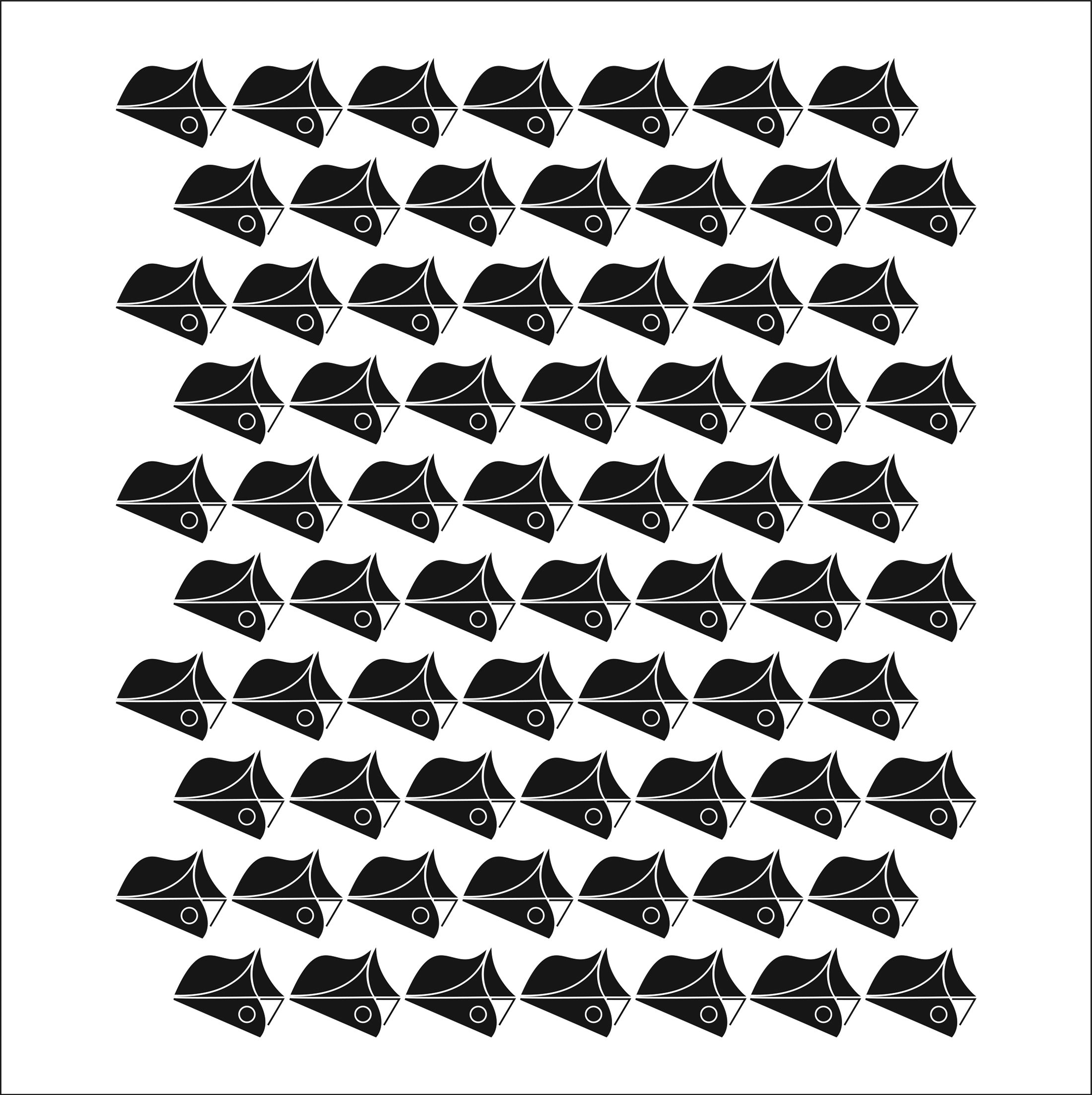
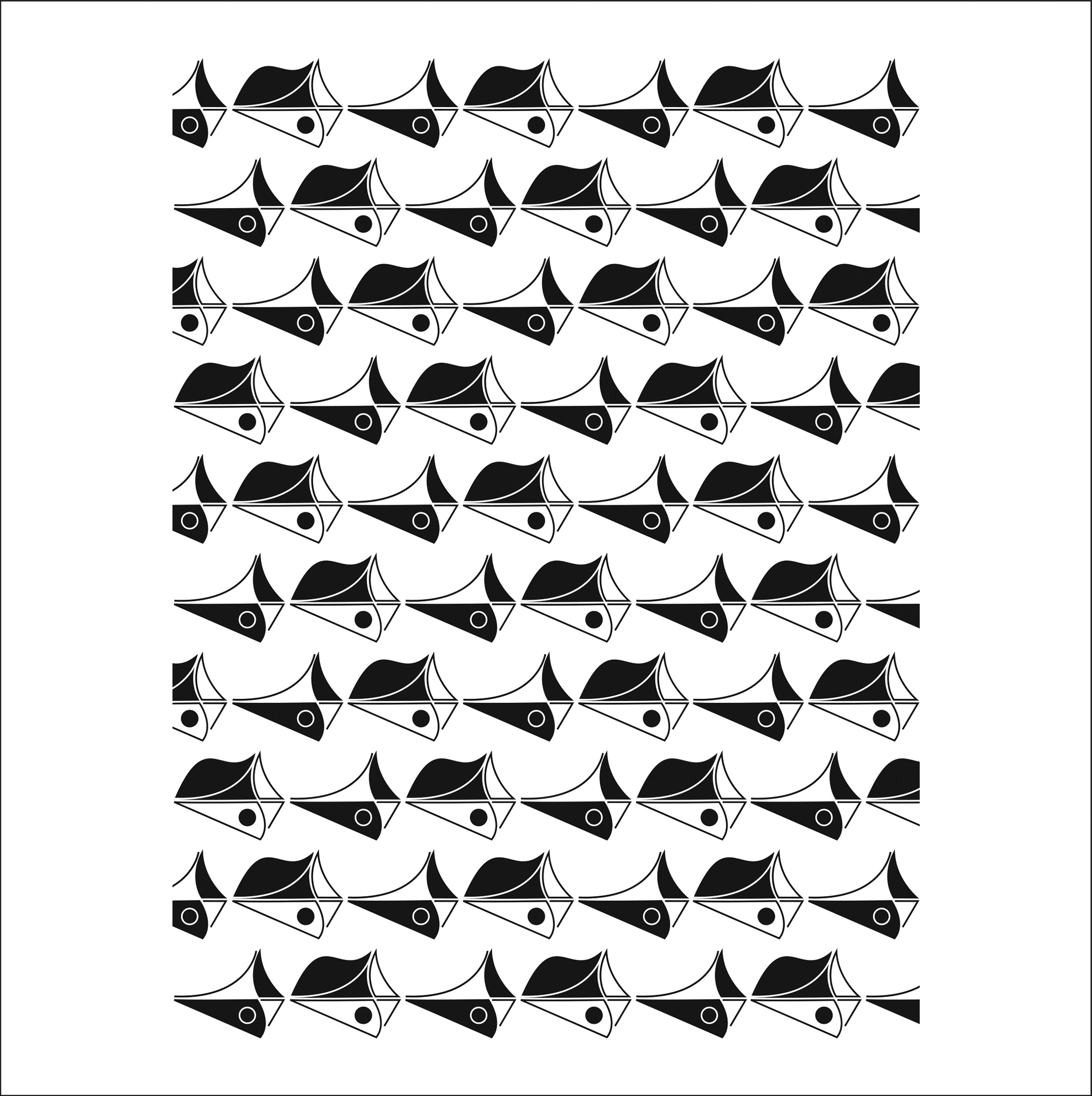
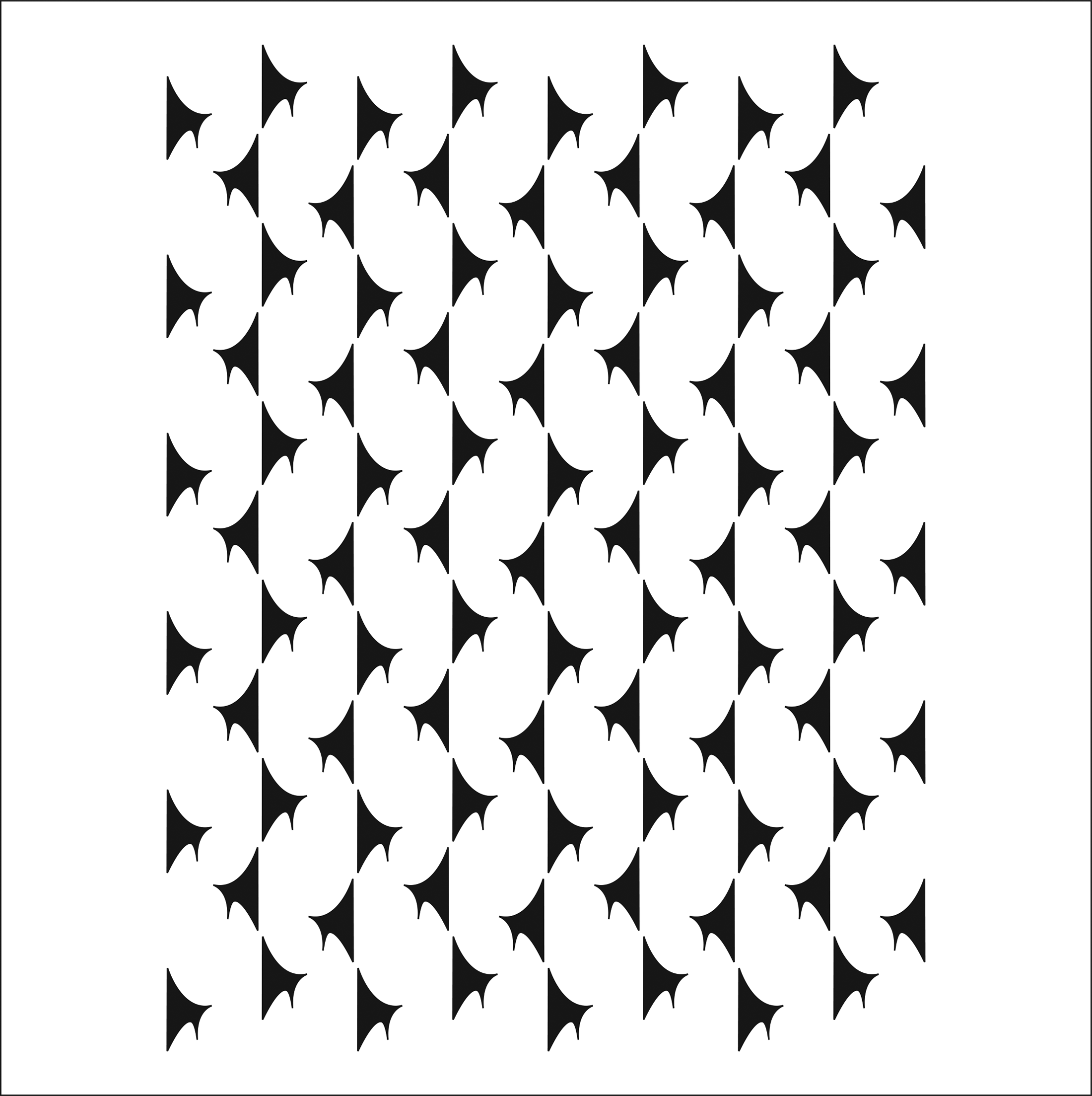
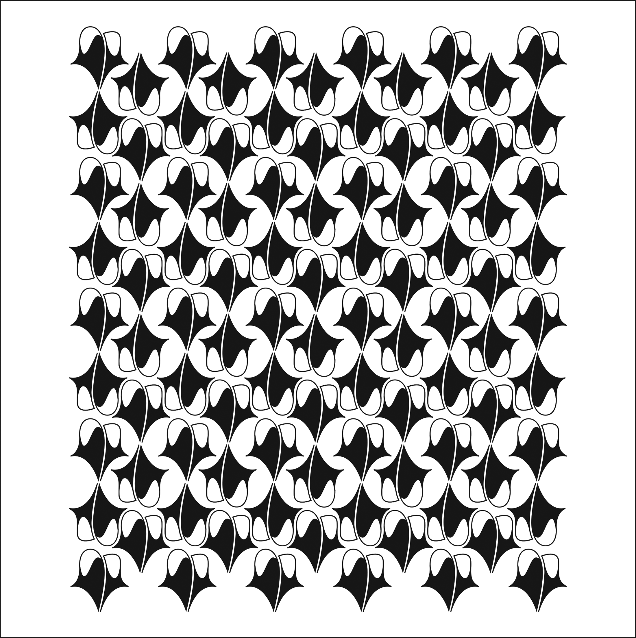
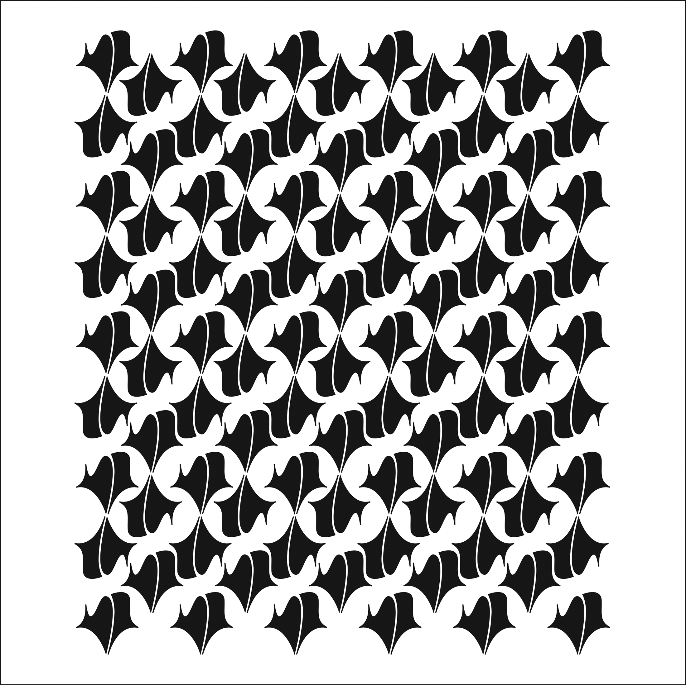
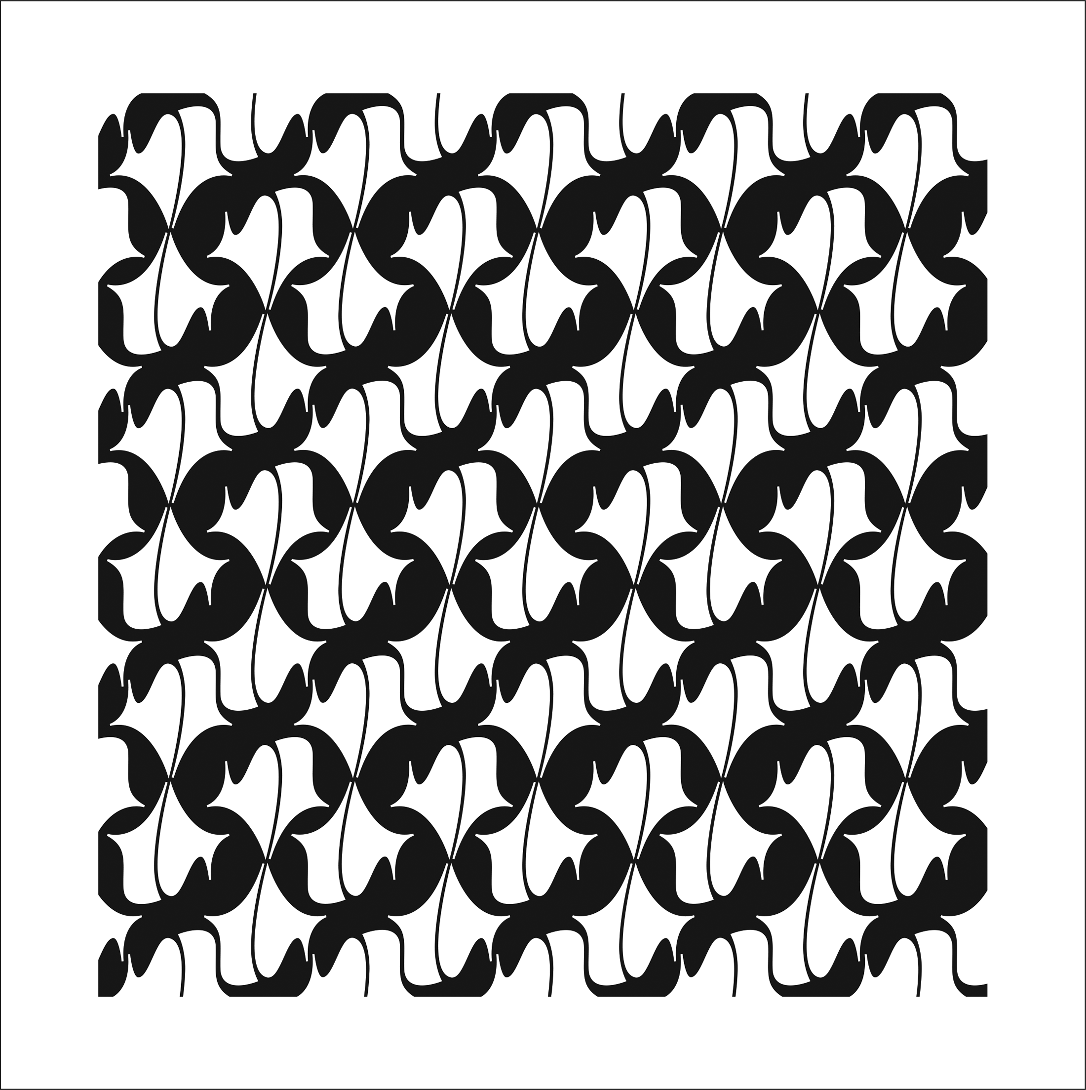
Тhis book is an outcome of my visual and theoretical research about the applicability of the grid in graphic systems. The use of the grid in graphic design and typography is very common; it is used for layout of books and magazines, and it is unavoidable in shaping graphic products that belong to the same series. Using the proportions of the grid, the graphic designer is capable to meticulously mantain the visual consistency of the series, while the client, or the receiver of the message, can easier read thе series. A series of postage stamps, banknotes or coins is a typical example of the use of the grid, where a graphic element, for instance, denomination – because of the consistency of the series – always appears in the same spot and the same size. Banknotes, coins and postage stamps that belong to a series can be distinguished by the motif, color, or size. However, the grid should not be turned into “prison bars” that will with their vertical and horizontal lines limit the designer’s creativity and imagination. Grids are a great help in graphic design, but they should not turn into a constraining tool. However, the compositions in this book are neither banknotes nor postage stamps. I wanted to avoid traditional graphic products and therefore I dealt with abstract compositions and patterns. Through diverse geometrical drawings, I played with the grid: to which extent is it a help, and when does it become an artist’s “cage”? As well, I was interested to explore to which extent the line, shape, and composition can contribute to the dynamic of the drawing. For that reason, all the compositions are conceived as sketches on a piece of paper, drawn by a B-pencil, and improved and finished in Adobe Illustrator. The black and white book is a compilation of the best sixty compositions, created during my research process on the grid. It has 86 pages, while the format is 8 x 8.5 inches (20.3 x 21.6 cm). The Grid is included in the collection of artistic books at the Archives and Special Collections Vernon R. Alden Library, Ohio University, Athens, Ohio, USA.

2011: Published on Designed, Belgrade, Serbia (an online magazine for design)

2011: Published in Ácido Surtido, No. 22, Buenos Aires, Argentina (art and design magazine)

2011: Published in UrbanStyleMag, No. 22, Mytilene, Lesbos, Greece (art & urban culture magazine)

2011: Published in Newdesign, No. 93, Warwick, England, United Kingdom (design magazine)

2012: Published in Design 360°, Guangzhou (Canton), China (concept and design magazine)

2015: Presented at the Oklahoma Art Education Association Fall Conference, Cameron University, School of Arts and Sciences, Department of Art, Lawton, Oklahoma, USA

2015: Presented at The Kemp Center for the Arts, Wichita Falls, Texas, USA

Client: Museum of Kozara, Prijedor, Bosnia and Herzegovina

Client: Museum of Kozara, Prijedor, Bosnia and Herzegovina
catalog and invitation card for my solo exhibition, 2009

These photographs were taken during my travels through Bosnia. Seventy photographs were exhibited at my solo photo expositions The Land of Miracles at Museum of Kozara, Prijedor, Bosnia and Herzegovina, Regional Museum, Gradiška, Bosnia and Herzegovina, and V. I. P. Art Gallery, Student Cultural Center, Belgrade, Serbia in 2009. I had the honor that Her Excellency, Ambassador of Bosnia and Herzegovina in Serbia, opened my exhibition in downtown Belgrade. The show was very well publicized on TV and in newspapers: Radio Television of Republic of Srpska, Banja Luka, Bosnia and Herzegovina, EuroBlic, Banja Luka, Bosnia and Herzegovina, and Kozarski Vjesnik, Prijedor, Bosnia and Herzegovina. The success was even greater when I sold sixteen framed photographs in Serbia and Bosnia-Herzegovina.

Rural Versus Urban

Rural Versus Urban
documentary photograph, 2009

Good timing is very important in documentary photography. If I appeared ten seconds earlier or ten seconds later, this picture would never have been made. It was taken in Banja Luka, the second largest Bosnian-Herzegovinian city. It shows a peasant and his horse in an urban environment.

2013: Selected for the 4th International Exhibition Art in Miniature, Cultural Center of Majdanpek, Majdanpek, Serbia

2013: Published in the catalog of the 4th International Exhibition Art in Miniature, Cultural Center of Majdanpek, Majdanpek, Serbia

2013: Published on Designed, Belgrade, Serbia (an online magazine for design)

Old Belgrade

Old Belgrade
art photograph, 2008

Kosančićev Venac is a historic neighborhood of Belgrade, the capital city of Serbia. This part of the downtown is named after Ivan Kosančić, the Serbian knight who bravely died in 1389 during the famous Battle of Kosovo. In 1895 Serbian sculptor Petar Ubavkić immortalized the hero in this bust which stands as one of the landmarks of this neighborhood.

2013: Selected for the exhibition The 10th Night of Museums, Cryptography of a City, Museum of Rudnik and Takovo Region, Gornji Milanovac, Serbia

2013: In a private collection in Belgrade, Serbia

Here I Come

Here I Come
documentary photograph, 2008

This photo was taken on the Islamic graveyard in Banja Luka in Bosnia and Herzegovina.

2012: Selected for the 3rd International Exhibition Art in Miniature, Cultural Center of Majdanpek, Majdanpek, Serbia

2012: Published in the catalog of the 3rd International Exhibition Art in Miniature, Cultural Center of Majdanpek, Majdanpek, Serbia

2012: Published on Designed, Belgrade, Serbia (an online magazine for design)

Living in Unity and Tolerance Despite the Differences

Living in Unity and Tolerance Despite the Differences
documentary photograph, 2008

The awarded photograph suggests that if wild and domestic animals can live together, why people of different races, religion and ethnicity could not do the same? This picture was taken in Teslić, Bosnia and Herzegovina. It was exhibited at the Exit music festival. (In 2006, The Guardian, a daily newspaper from London, declared Exit as the best festival in the world while CNN included Exit on the list of nine best festivals in the world. The Sun, London and EuroNews proclaimed it as one of the top ten music festivals in Europe.)

2008: Selected for the exhibition of the best photographs from the competition The Richness of Difference – Multiculturalism and Tolerance, 9th Exit Festival, The Petrovaradin Fortress, Novi Sad, Serbia. The 3rd Place Award for the Best Photo

2009: Solo photo exhibition The Land of Miracles, Museum of Kozara, Prijedor, Bosnia and Herzegovina

2009: Solo photo exhibition The Land of Miracles, Regional Museum, Gradiška, Bosnia and Herzegovina

2009: Solo photo exhibition The Land of Miracles, Students’ Cultural Center, V. I. P. Art Gallery, Belgrade, Serbia

The Railway

The Railway
art photograph, 2008

This photo was taken on the railway station in Doboj, Bosnia and Herzegovina. The plate in the first plan warns about danger of electrical shock. The warning is written in Serbian language.

2009: Selected for the digital exhibition Glocal Project, Surrey Art Gallery, Surrey, British Columbia, Canada

2009: Selected for the 14th April Meetings, (multimedia art festival), Student Cultural Center, V.I.P. Art Gallery, Belgrade, Serbia

2009: Solo photo exhibition The Land of Miracles, Museum of Kozara, Prijedor, Bosnia and Herzegovina

2009: Solo photo exhibition The Land of Miracles, Regional Museum, Gradiška, Bosnia and Herzegovina

2009: Solo photo exhibition The Land of Miracles, Students’ Cultural Center, V.I.P. Art Gallery, Belgrade, Serbia

Client: Kordun Elektro, Belgrade, Serbia, electrical equipment shop

Client: Kordun Elektro, Belgrade, Serbia, electrical equipment shop
wall and table calendar, 2007

This company is selling electrical equipment and installations, so they wanted a wall and table calendar with the elements of electric power. I was the author of the photograph, in which you can see a traffic light, transformer, wires, and neon lights. There are two clouds on the top: snowy and rainy. The idea behind these illustrations is that hydro plants produce more electric power when the level of rivers and lakes is higher due to snowing and raining.

2008: These wall and table calendars were selected for the 12th Exhibition of the Most Beautiful Calendars and Christmas Cards, Museum of Contemporary Art of Vojvodina, Novi Sad, Serbia. They were awarded with the Honorable Mention for Graphic Design.

2008: The calendars were published in the catalog of the 12th Exhibition of the Most Beautiful Calendars and Christmas Cards, Museum of Contemporary Art of Vojvodina, Novi Sad, Serbia

The Catacombs

The Catacombs
digital art, 2007

This photograph of the medieval nobleman catacombs in Jajce, Bosnia and Herzegovina was my subject of interest. When I returned home, I edited this composition in Adobe Photoshop trying to create an artwork which would look like an etching. The Jajce underground chapel and crypt is the burial site of Grand Duke of Bosnia, Hrvoje Vukčić. The underground complex was built approximately between 1400 and 1416.

2007: Selected for the 8th ArtTech, International Festival of Digital Art, Pančevo, Serbia

Client: Borba, Belgrade, Serbia, a daily newspaper

Client: Borba, Belgrade, Serbia, a daily newspaper 
symbol/illustration for an article, 2007

The October Revolution is a homage to communist iconography. The red star consists of five arrows that represent the spreading of communist ideas all over the world after the outbreak of October Revolution in Petrograd (Saint Petersburg) in 1917. The logo copyright is protected by the Intellectual Property Office, Belgrade, Serbia.

2007: Selected for the 8th ArtTech, International Festival of Digital Art, Students’ Center, Pančevo, Serbia

2007: Published in Borba, No. 28300, Belgrade, Serbia

2011: Published in the book Significity (anthology of the best 2500 Serbian and Yugoslav logos 1960-2010), Belgrade, Serbia

Dejan Mraovic, The October Revolution, symbol

Client: Borba, Belgrade, Serbia, a daily newspaper

Client: Borba, Belgrade, Serbia, a daily newspaper 
art photograph, 2007

Borba was a renowned Yugoslav and Serbian daily newspaper which was published from 1922 until 2009. I had the great honor of having my three photographs chosen to be printed on the cover page of Borba in 2007. Two of them were documentary, humorous pictures, while the third one was an artistic landscape made near Srbac in Bosnia and Herzegovina. Lake Bardača is on the Ramsar List of Wetlands of International Importance since it is a habitat for over 170 bird species. This Nature Park is well-known for its marshes and aquatic flora and fauna.

2007: Published on the cover page of Borba, No. 28137, Belgrade, Serbia

2009: Solo photo exhibition The Land of Miracles, Museum of Kozara, Prijedor, Bosnia and Herzegovina

2009: Solo photo exhibition The Land of Miracles, Regional Museum, Gradiška, Bosnia and Herzegovina

2009: Solo photo exhibition The Land of Miracles, Students’ Cultural Center, V.I.P. Art Gallery, Belgrade, Serbia

2009: In a private collection in Belgrade, Serbia

Marshal Tito

Marshal Tito
documentary photograph, 2007

The territory of the former Yugoslavia went through a period of great instability due to the lack of ethnic and religious tolerance, which is obvious in this photo. The photograph was deliberately created during the “blue” dusk in order to emphasize the feeling of sadness. It was taken in Tuzla, Bosnia and Herzegovina. Josip Broz Tito was a Yugoslav communist revolutionary and leader of Socialist Yugoslavia from 1943 until his death in 1980.

2008: Selected for the 9th International Biennial of Miniature Art, The Cultural Center of Gornji Milanovac, Gornji Milanovac, Serbia

2009: Solo photo exhibition The Land of Miracles, Museum of Kozara, Prijedor, Bosnia and Herzegovina

2009: Solo photo exhibition The Land of Miracles, Regional Museum, Gradiška, Bosnia and Herzegovina

2009: Solo photo exhibition The Land of Miracles, Students’ Cultural Center, V. I. P. Art Gallery, Belgrade, Serbia

2010: In a private collection in Jefferson City, Tennessee, USA

The Big Sleeper

The Big Sleeper
documentary photograph, 2007

The Big Sleeper was captured in a photo that I took in Kaluđerica, Serbia.

2009: Selected for the digital exhibition Glocal Project, Surrey Art Gallery, Surrey, British Columbia, Canada

Client: Hedone, Belgrade, Serbia, a publishing house

Client: Hedone, Belgrade, Serbia, a publishing house
book cover, front and back, 2007

I am the author of this photograph and cover design for McBride’s book on philosophy. The original title in English is From Yugoslav Praxis to Global Pathos: Anti-Hegemonic Post-Post-Marxist Essays. William McBride is Distinguished Professor of Philosophy at Purdue University, College of Liberal Arts, West Lafayette, Indiana. My photo shows the steam locomotive Proleterka which was part of Josip Broz Tito’s train at Oštrelj near Bosanski Petrovac in Bosnia. The partisans’ train from WW2 was unfortunately damaged during the Yugoslav civil war and that is why the publisher accepted this sad motif for the cover page.