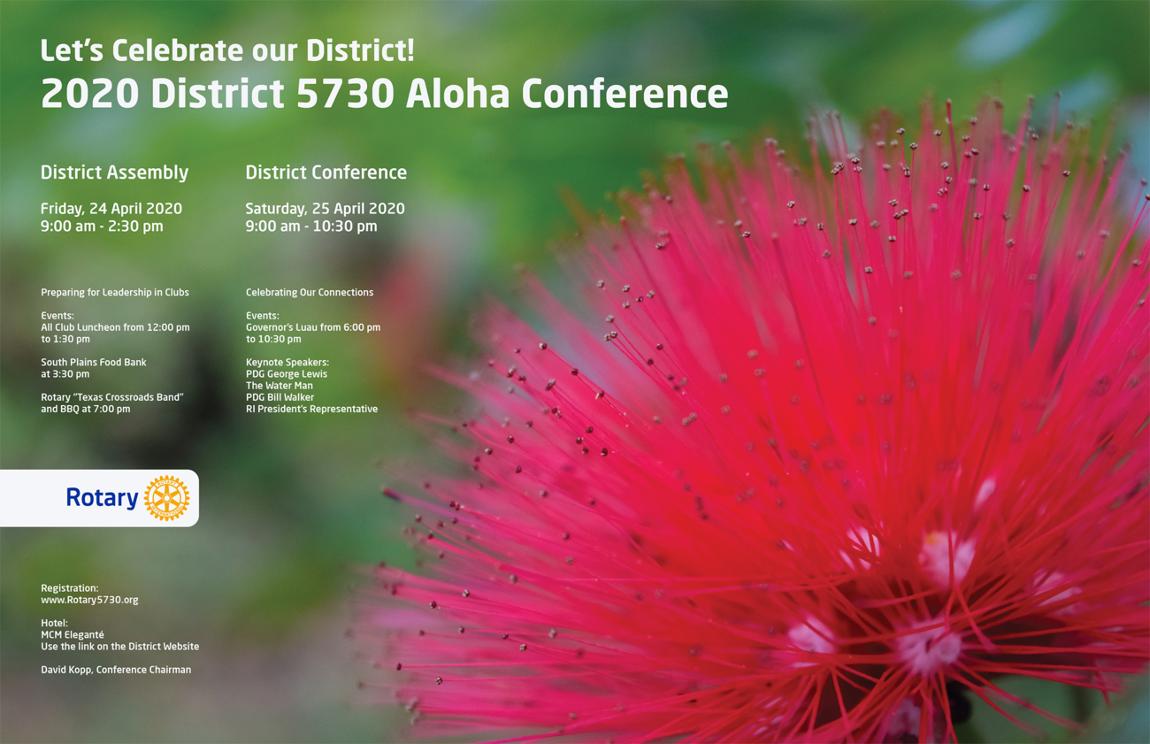
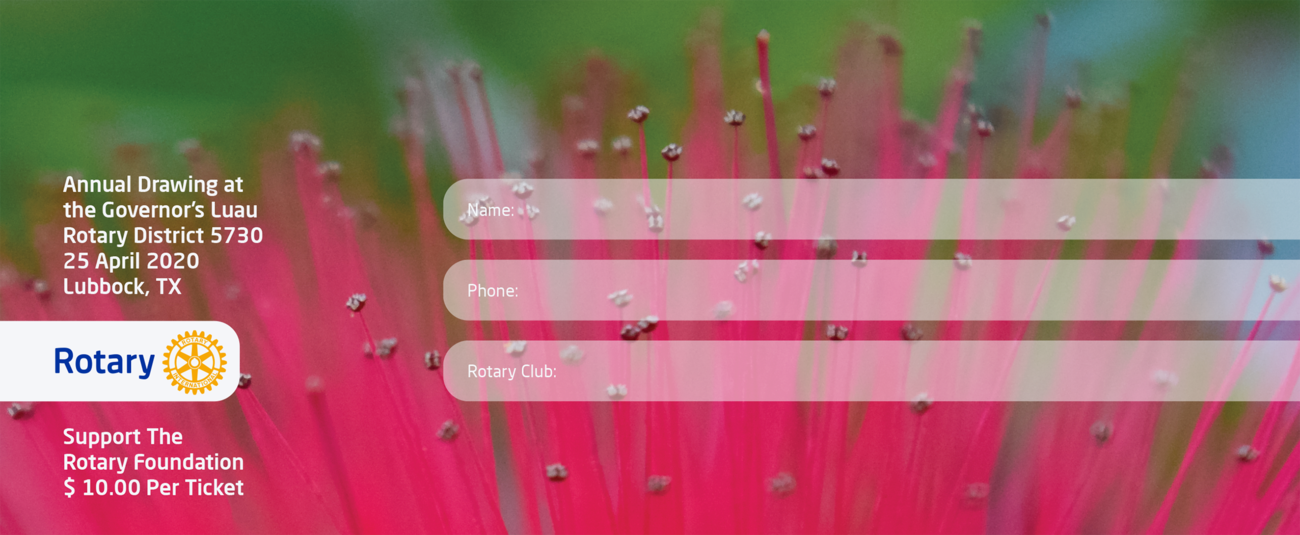
Client: Rotary International District 5730, Lubbock, Texas, USA tabloid poster and ticket for a conference, 2020
Rotary District 5730 encompasses over fifty Rotary clubs across the Texas Panhandle. It was established in 1921. These poster and ticket were commissioned for the 2020 annual meeting in Lubbock, Texas. The theme of the conference was Aloha. The ōhiʻa lehua flower (Metrosideros polymorpha) is recognized as the national symbol of Hawaii, and it served as the inspiration for this visual identity.
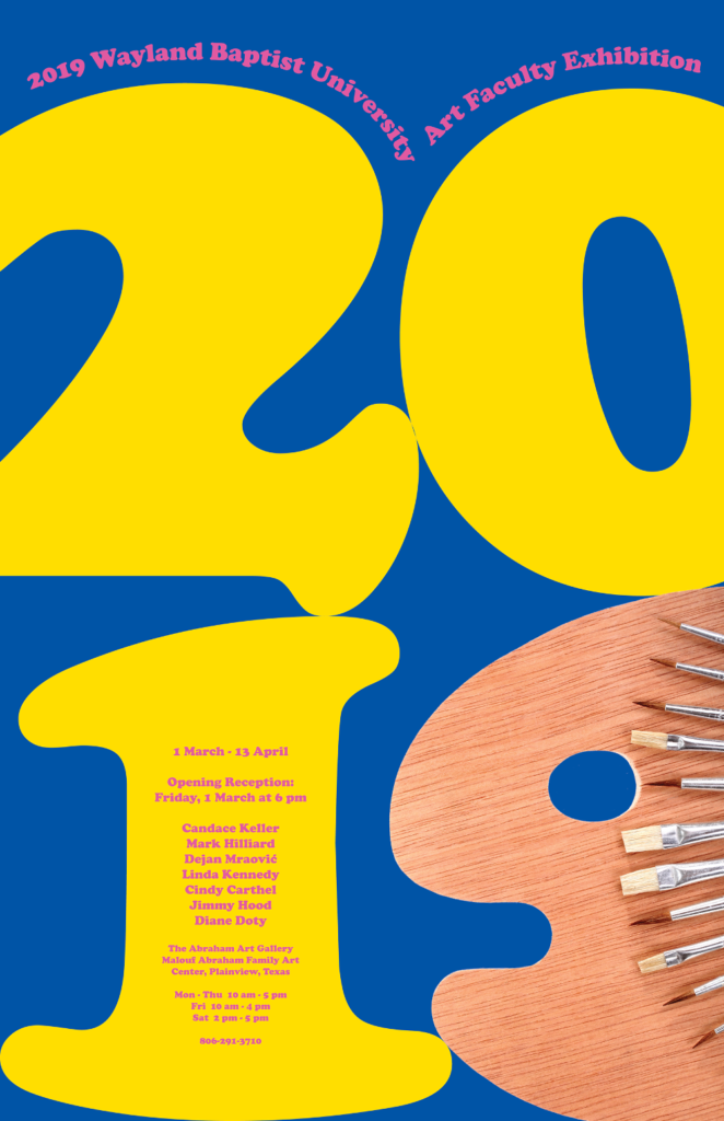
Client: Wayland Baptist University, School of Fine Arts, Art Department, Plainview, Texas, USA a tabloid poster for a group art exhibition, 2019
Since it was used to announce and promote the art faculty triennial, the poster uses the official colors of the Wayland Baptist University. The number 9 in 2019 was presented as a paint palette with brushes fanned above.
2021: Selected for 5th Co|Show, international poster biennial, Colorado Mesa University, Grand Junction, Colorado, USA
2022: Selected for the Posters Stellars 2nd Intercontinental Poster Exhibition, Fairfield, New Jersey, USA
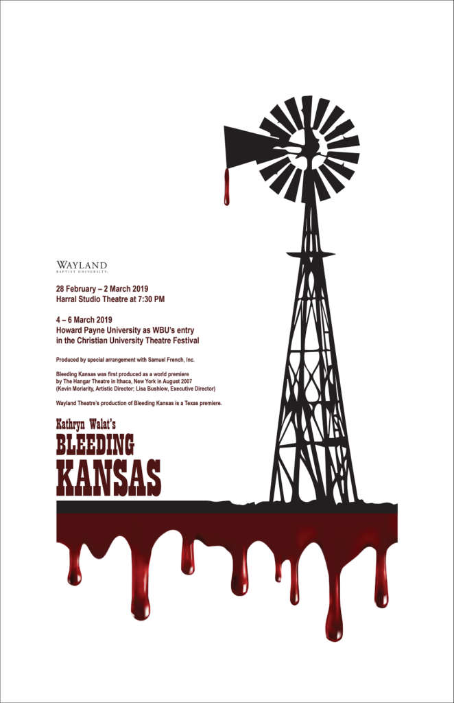
Client: Wayland Baptist University, School of Fine Arts, Theatre, Plainview, Texas, USA a tabloid poster for a historical drama, 2019
This poster was made for Wayland Baptist University’s Theatre department. A windmill is recognizable icon of the American Midwest. The dripping blood all over the prairie foreshadows the oncoming civil war. The large margins pay homage to the feeling of isolation and division between the Kansans. The slab serif typography is from the time period.
2021: Selected for 5th Co|Show, international poster biennial, Colorado Mesa University, Grand Junction, Colorado, USA
2022: Selected for 1st Theatrical Posters International Festival, Gabriel Sundukyan National Academic Theater, Yerevan, Armenia
Client: Cornerstone United Methodist Church, Oklahoma City, Oklahoma, USA logotype, 2018
This logotype utilizes the T of the font to display a common symbol of Christianity as a lighthouse of faith. The font used for this typographic composition is Phosphate. The capital letters E are aligned vertically which bring the sense of order and balance to the logotype.
2022: Selected for Plains Art Association 60th Annual Juried Spring Celebration of Art, Wayland Baptist University, the Abraham Art Gallery, Malouf Abraham Family Art Center, Plainview, Texas, USA
2023: Selected for the 3rd Creative Bridge – Novosibirsk 2023, the international exhibition of design and visual arts, Novosibirsk State Museum of Local History and Nature, Novosibirsk, Russia
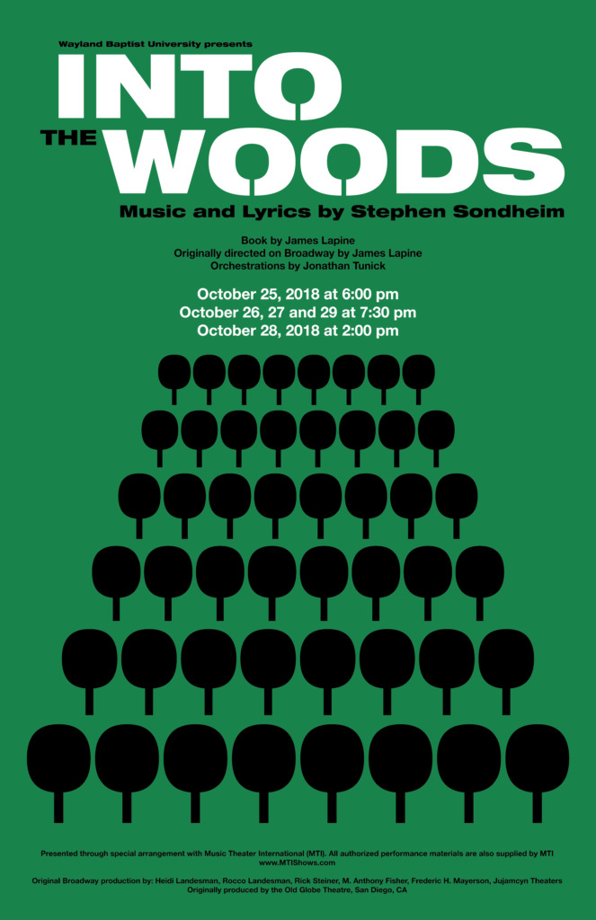
Client: Wayland Baptist University, School of Fine Arts, Theatre, Plainview, Texas, USA a tabloid poster for a musical, 2018
In fall of 2018 Prof. Dr. Marti Runnels reached out to me to design a tabloid poster for his musical Into the Woods with music by Stephen Sondheim and based on the book by James Lapine. This piece is inspired by the Serbian graphic design and typography from the early 1980’s. The basic element of this poster is the tree. The trunk of the tree is made of the letter I, and the foliage is comprised of the letter O both sampled from the font Helvetica Bold. The rows of black trees that resemble the woods are in visual unity with the white header. The title is organized around three capitalized letters O. The counters (partially or impartially enclosed areas within certain letters), are drawn in the shapes of three green trees. The composition is structured in a one-point perspective beginning with the widest row of black trees in the foreground and ending with three green trees in header.
2021: Selected for the Posters Stellars 1st Intercontinental Poster Exhibition, Fairfield, New Jersey, USA
2021: Selected for 5th Co|Show, international poster biennial, Colorado Mesa University, Grand Junction, Colorado, USA
2022: Selected for 1stTheatrical Posters International Festival, Gabriel Sundukyan National Academic Theater, Yerevan, Armenia
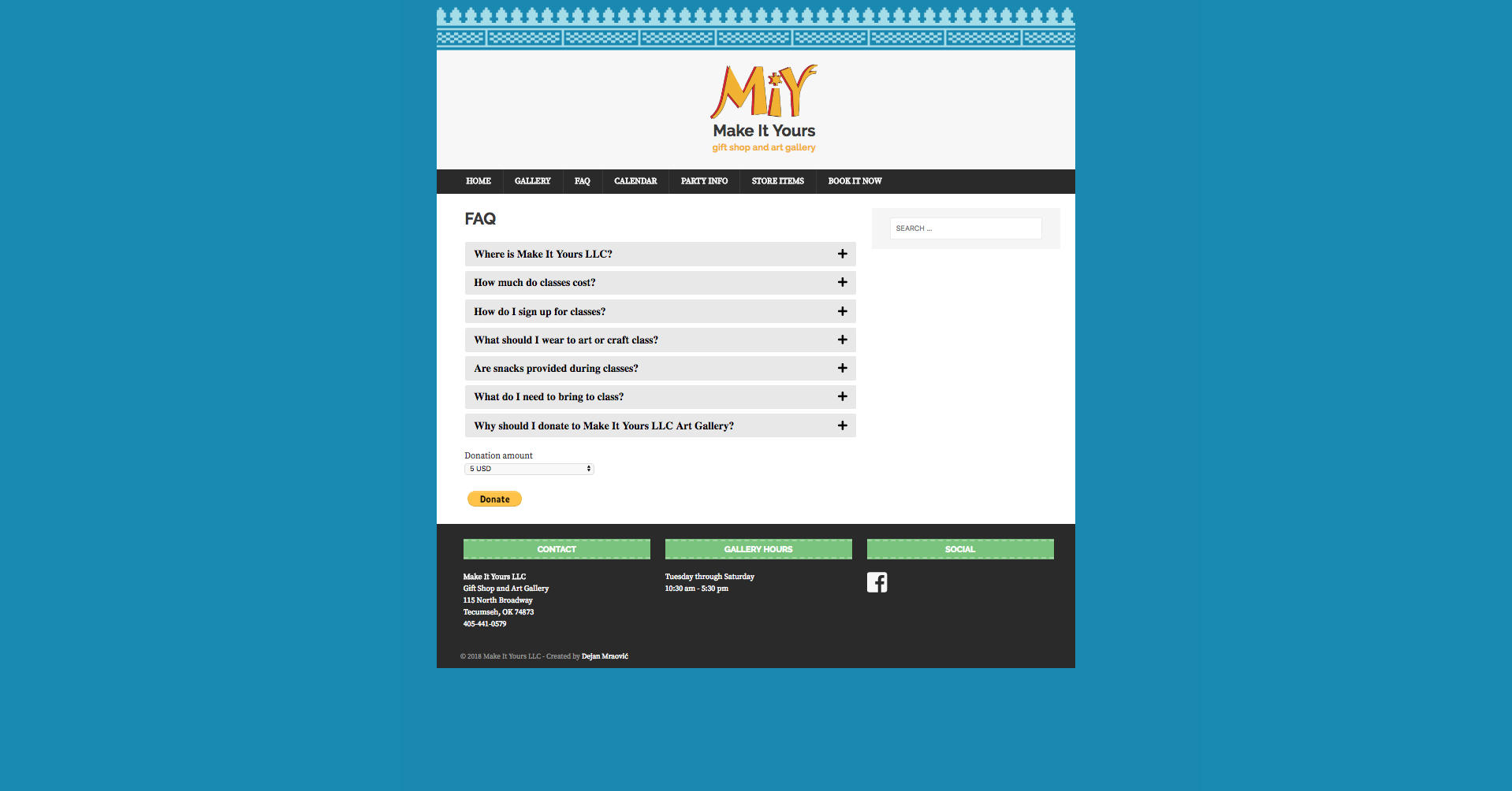
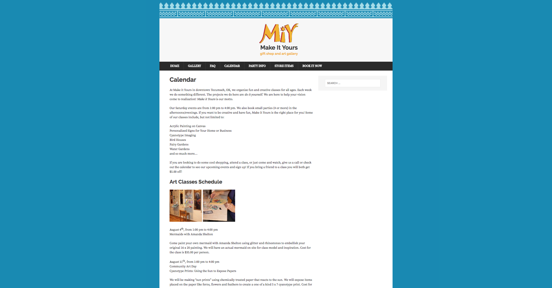
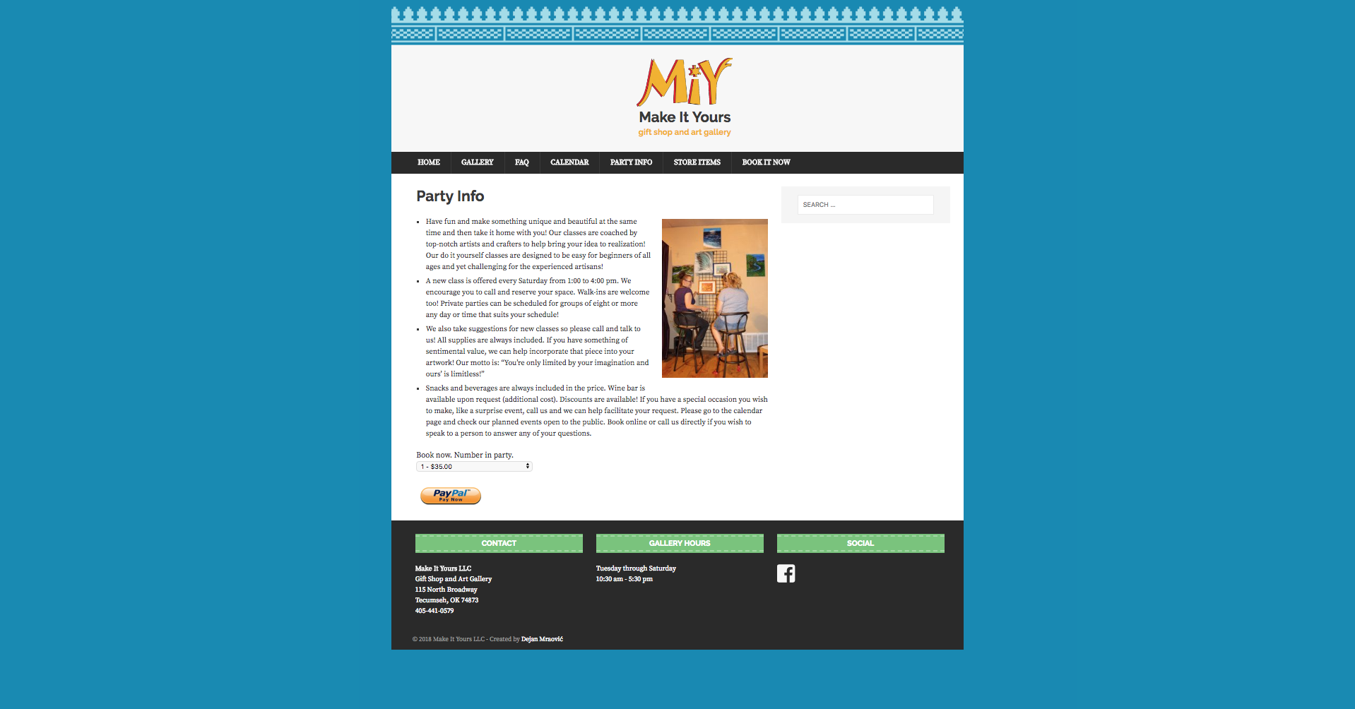
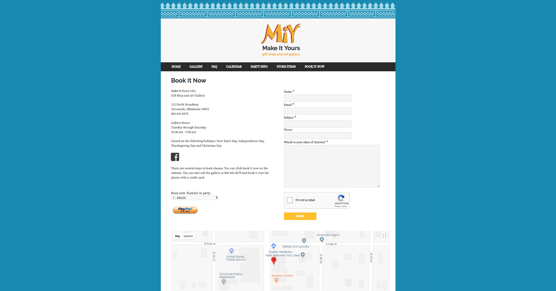
Client: Make It Yours, Gift Shop & Art Gallery, Tecumseh, Oklahoma, USA website, 2018
Make It Yours is a gift shop and art gallery in historic downtown Tecumseh, Oklahoma. They hired me in 2018 to design website for them. The decoration seen on the top of each web page is taken from the ornaments on top of the building. The MIY logo was designed by the owner.
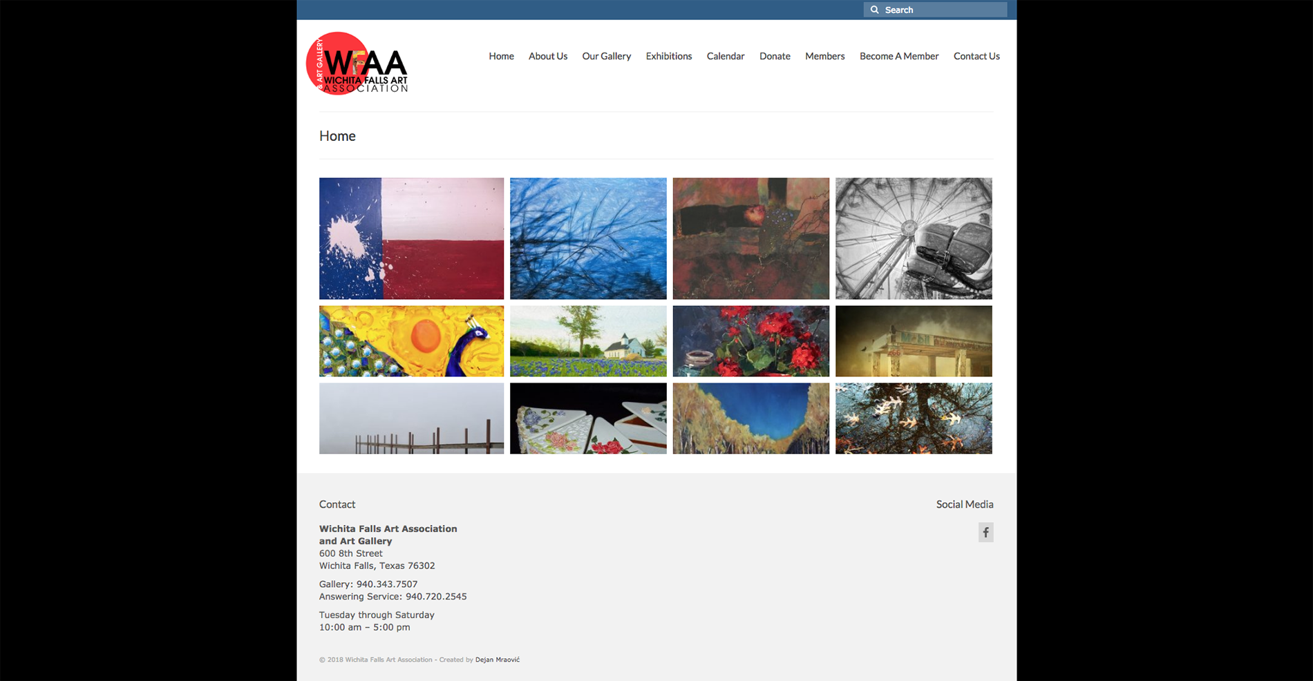
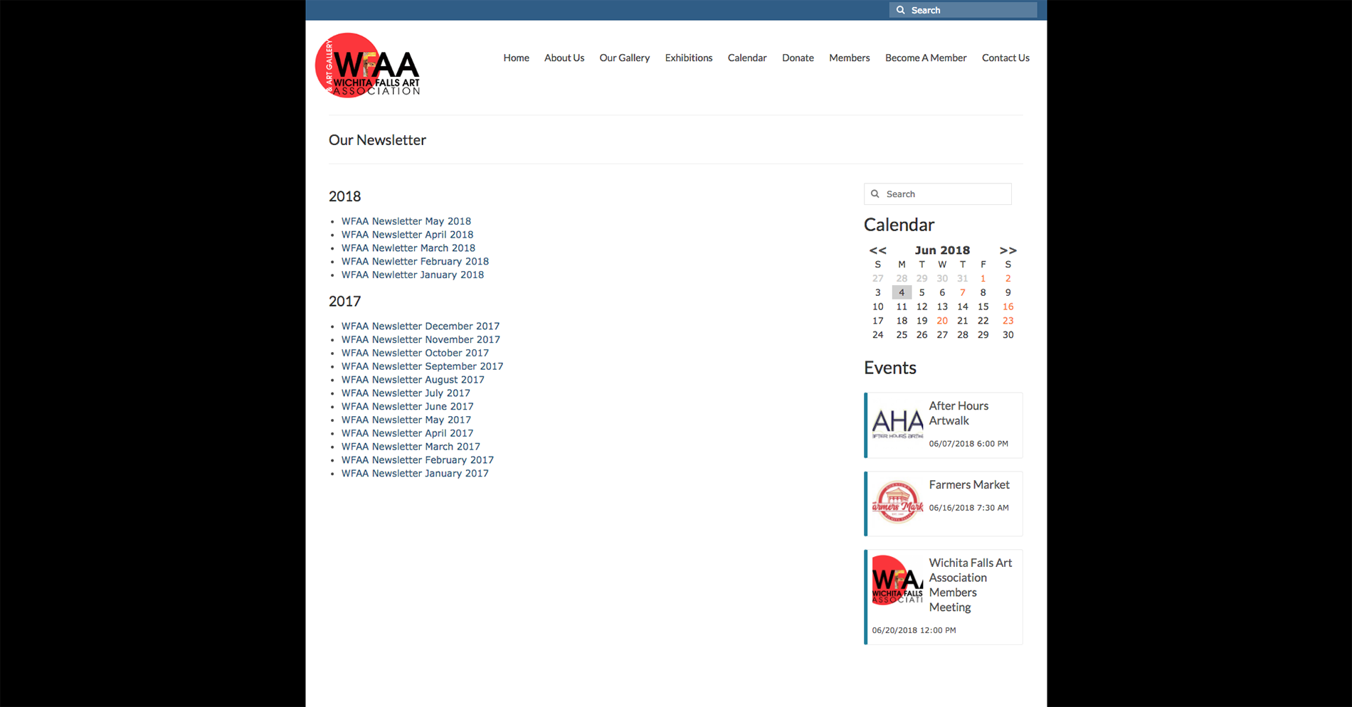
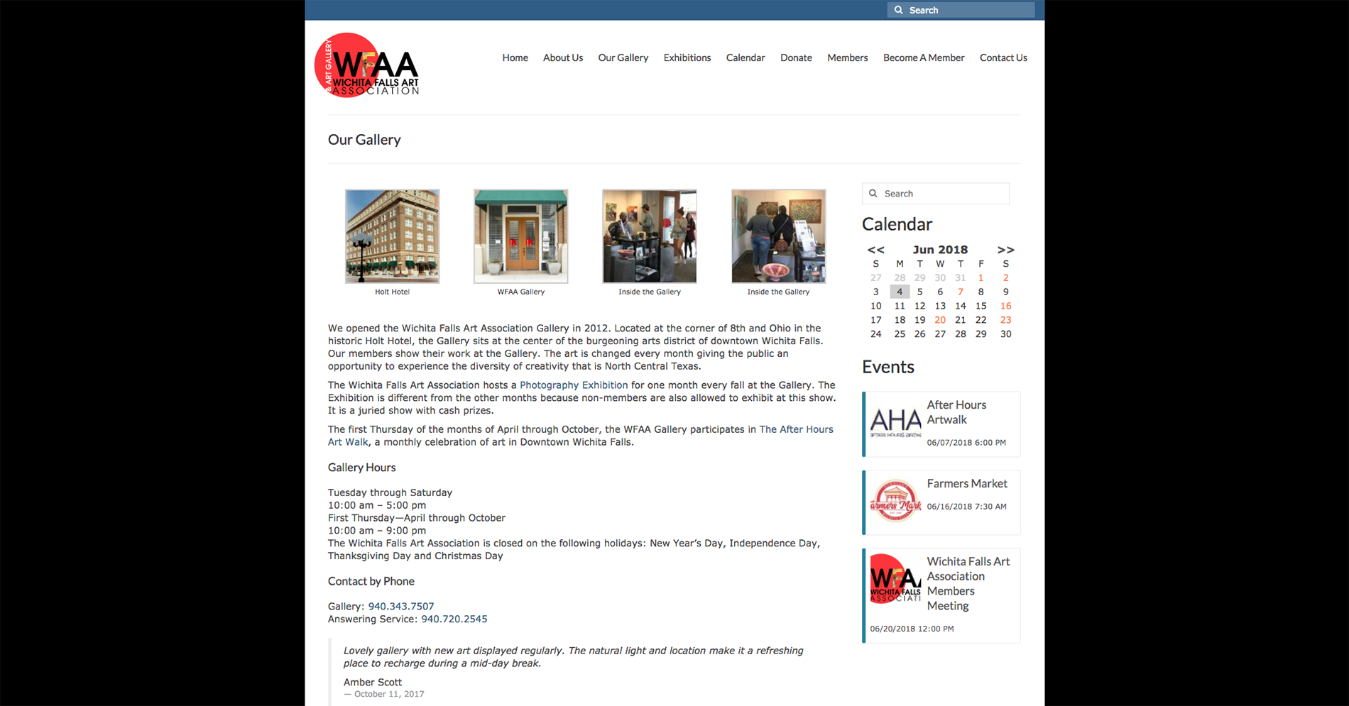
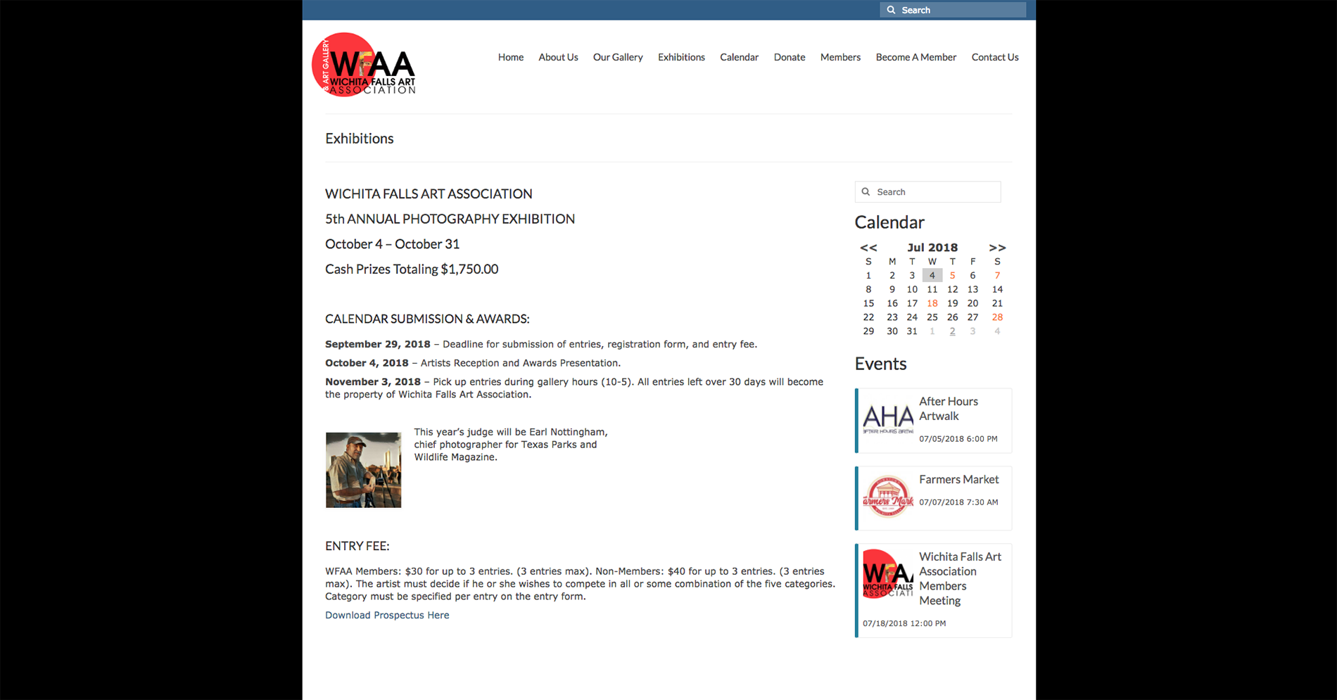
Client: Wichita Falls Art Association & Art Gallery, Wichita Falls, Texas, USA website, 2018
The Wichita Falls Art Association was founded in 1949 as a non-profit organization. The Wichita Falls Art Association Gallery opened in 2012 in the historic Holt hotel in downtown Wichita Falls. I was hired in 2018 to design their website. I did not design their logo.
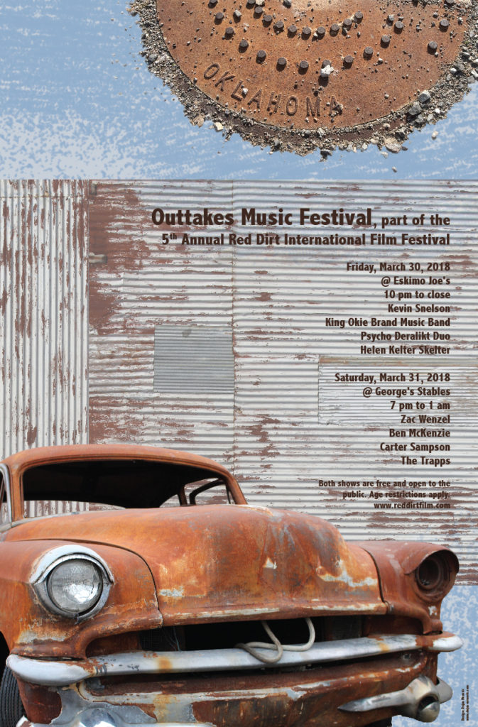
Client: Red Dirt International Film Festival, Stillwater, Oklahoma, USA tabloid poster, 2018
Red Dirt International Film Festival is always shown at Oklahoma State University in Stillwater, Oklahoma. The poster is advertising the after-event mixer with musicians. The red dirt of Oklahoma evokes a rustic feel to the poster. When designing this piece, I experimented with cleaning up the manhole cover’s edge, but I ultimately decided that the rough, textured border helps to unify the rusted American car and the old barn.
2023: Selected for the 3rd Creative Bridge – Novosibirsk 2023, the international exhibition of design and visual arts, Novosibirsk State Museum of Local History and Nature, Novosibirsk, Russia
Client: Sheesh Mahal, Pakistani Restaurant, Oklahoma City, Oklahoma, USA logo, 2017
Sheesh Mahal is the most popular Pakistani restaurant in Oklahoma City. It is named after the 17th century palace in Lahore built by Mughal Emperor Shah Jahan. The Sheesh Mahal is architectural masterpiece and has been inscribed as a UNESCO World Heritage Site. In this artwork, I tried to capture the mysticism and exoticness of the building. The focal point of my logo is one of Sheesh Mahal’s arches which is placed on the cutting board. White crescent, the well-known symbol of Islam and Pakistan, replaced the hole for hanging at the top of the cutting board. The moon also confirms that all the meals prepared in this restaurant are made in accordance with Islamic dietary law (halāl food). My goal was to design an original logo that is both distinguishable and easily recognizable while honoring great Muslim cultural heritage.
2023: Selected for the 3rd Creative Bridge – Novosibirsk 2023, the international exhibition of design and visual arts, Novosibirsk State Museum of Local History and Nature, Novosibirsk, Russia
Client: Cornerstone United Methodist Church, Oklahoma City, Oklahoma, USA logo, 2017
Cornerstone United Methodist Church from Oklahoma City organizes a free community dinner every last Thursday of the month. My goal was to make a sleek and recognizable logo which can easily communicate with an audience even without a title or textual explanation: dinner (fork) + church (Latin cross) = Dinner Church. And there is a third, subliminal message in this artwork: the logo’s silhouette is designed to look like the front façade of a cathedral.
2022: Selected for the Ampersand 2022 – 4th International Logo Exhibition, Nádor Gallery, Budapest, Hungary
Client: Dennis’ Tree Service, Oklahoma City, Oklahoma, USA logo, 2017
Dennis’ Tree Service is a company that trims and cuts trees and shrubs in the Oklahoma City area. This logo is a combination of the lower-case letter d and a stylized tree. The yellow letter d represents the owner’s initial. The fully enclosed space within the letter d, which is called a counter in typography, is the green foliage of a deciduous tree.
2019: Wayland Baptist University Art Faculty Triennial Exhibition, Wayland Baptist University, the Abraham Art Gallery, Malouf Abraham Family Art Center, Plainview, Texas, USA
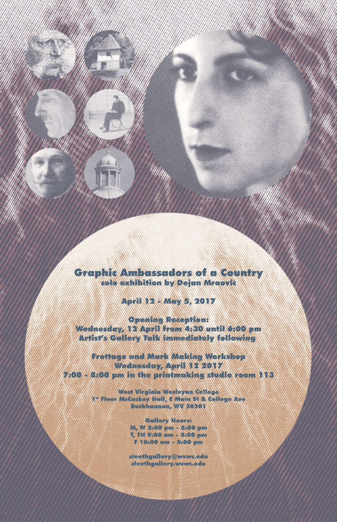
Client: West Virginia Wesleyan College, School of Fine Arts and Humanities, Art & Design Department, Buckhannon, West Virginia, USA a tabloid poster for solo exhibition, lecture and workshop, 2017
In 2017 West Virginia Wesleyan College brought me as a Visiting Artist to Buckhannon. Sleeth Gallery, a contemporary art gallery, was the venue for my 6th solo exhibition Graphic Ambassadors of a Country. At the opening of the show, I presented a lecture about my visual research. I also did one hour long artistic workshop for the WVWC students. The tabloid poster presented on this page was used to announce all these events. That solo exhibition showed my process of creating new dinars. The portraits of the famous Serbs, that I placed on my banknotes, were reused in poster design. The female portrait in the upper right corner represents Milena Pavlović Barilli (1909-1945), surrealist painter, illustrator and poet. In the upper left corner, there is a picture of Vuk Stefanović Karadžić (1787-1864) and his birth house in Tršić. He was a philologist, linguist, and the major reformer of the Serbian language. The world-famous inventor, electrical engineer, and physicist, Nikola Tesla (1856-1943), is shown in the second row. The powerful Tesla coil, an electrical resonant transformer circuit, was used as the poster’s background. In the third row, there is a portrait of Slobodan Jovanović (1869-1958), lawyer, historian, and politician next to the architectural detail from the National Assembly in Belgrade.
2017: Published on SEEcult, Belgrade, Serbia (an online magazine for the culture of Southeastern Europe)
2019: Wayland Baptist University Art Faculty Triennial Exhibition, Wayland Baptist University, the Abraham Art Gallery, Malouf Abraham Family Art Center, Plainview, Texas, USA
Client: Rotosun, Siófok, Hungary, portable solar panels logo, 2016
Mr. Milutin Milovanović, an eagle scout, designed portable sun tracking solar panels for scouts which deliver 30% more energy than similar products available on the market. His invention was presented in 2016 at the Climate Launchpad, the largest green business idea competition in Europe. On the Grand National Final which was held in Budapest, Hungary, Mr. Milovanović won the 3rd Place Award for the Best Green Business Idea. His goal is to substitute portable petrol generators with clean solar power wherever it is possible and educate young generations of scouts on climate change. When I was commissioned to make a new logo for this project and company, I almost immediately got an idea to design a warm, orange, rotating sun which consists of numerous solar panels.
2019: Wayland Baptist University Art Faculty Triennial Exhibition, Wayland Baptist University, the Abraham Art Gallery, Malouf Abraham Family Art Center, Plainview, Texas, USA
2023: Selected for the 3rd Creative Bridge – Novosibirsk 2023, the international exhibition of design and visual arts, Novosibirsk State Museum of Local History and Nature, Novosibirsk, Russia
2023: Selected for the Intercontinental Biennial, Édgar Negret Museum, Bogotá, Colombia (19,543 designs submitted by 17,125 artists. Only 625 artworks were chosen.)
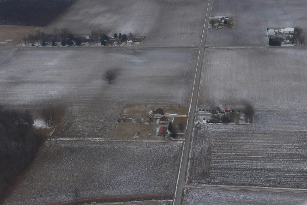
In 2016 I was invited to be the visiting artist at Purdue University in Fort Wayne, Indiana. This aerial landscape photo was taken just before landing at the Fort Wayne International Airport on a cold February day.
2018: Selected for the Judged Art Show & Sale, Muskogee Art Guild Gallery, Muskogee, Oklahoma, USA
2019: Wayland Baptist University Art Faculty Triennial Exhibition,Wayland Baptist University, the AbrahamArt Gallery, Malouf Abraham Family Art Center,Plainview, Texas, USA
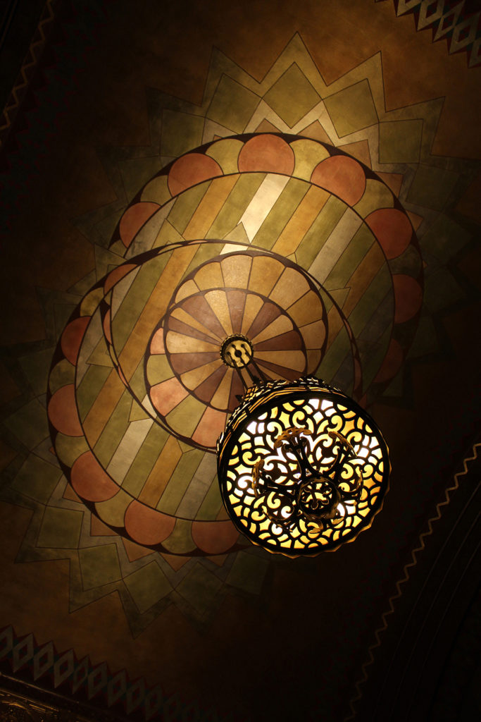
Tulsa Art Deco Museum, Tulsa, Oklahoma art photograph, 2015
Tulsa is famous for its beautiful Art Deco which flourished during the city’s oil boom years in the 1920’s and 1930’s. This image was created in the lobby of the Philcade Building which is the home of the Tulsa Art Deco Museum. This 13-story office building was designed by Leon B. Senter and erected for oilman Waite Phillips between 1929 and 1931. The lobby’s arched ceiling is hand painted and trimmed with gold leaf.
2016: Selected for the Wichita Falls Art Association 3rd Annual Photography Exhibition, Wichita Falls Art Association Gallery, Wichita Falls, Texas, USA
2017: Selected for the Wichita Falls Art Association 4th Annual Photography Exhibition, Wichita Falls Art Association Gallery, Wichita Falls, Texas, USA
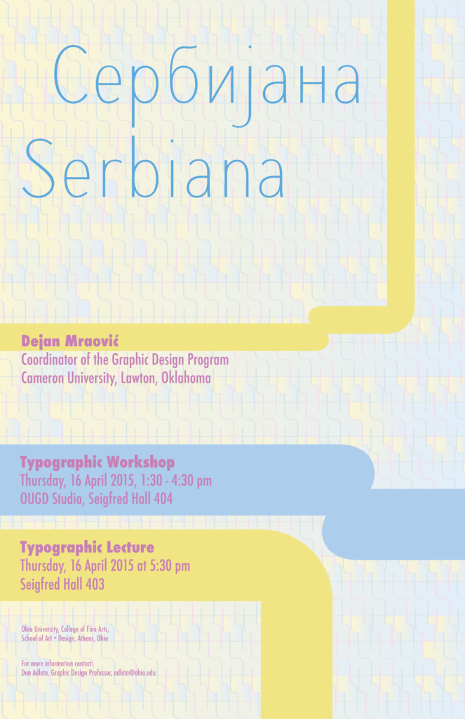
Client: Ohio University, College of Fine Arts, School of Art + Design, Athens, Ohio, USA a poster for lecture and typographic workshop, 2015
To create a background for this tabloid size poster, I used a lower-case letter t from font Serbiana and multiplied it numerous times until I created a “fence like” pattern of very light appearance. The poster design is partially based on my 50 dinars banknote. The primary colors are used to attract the viewers’ attention.
2015: Published on SEEcult, Belgrade, Serbia (an online magazine for the culture of Southeastern Europe)
2015: Published on Designed, Belgrade, Serbia (an online magazine for design)
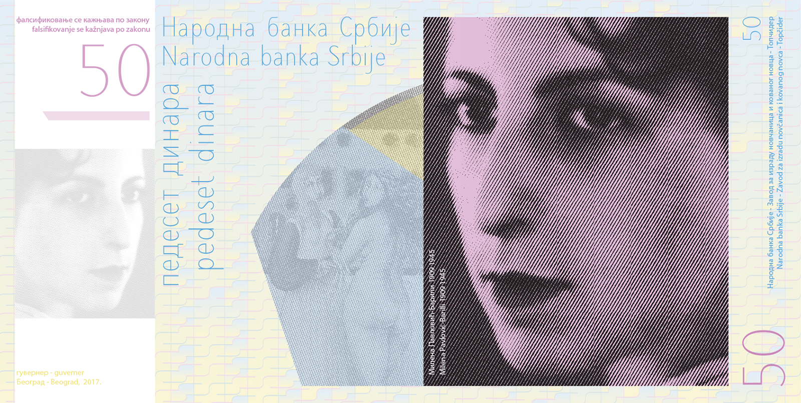
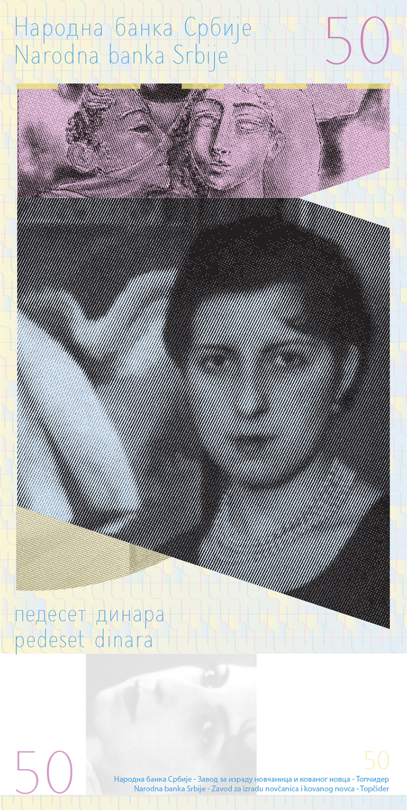
Fifty Dinars Bill (pedeset dinara), the 3rd series obverse (left) and reverse (right), 2015
This banknote is one of nine from the new series of dinars that I am currently working on in order to propose it to the National Bank of Serbia in Belgrade. In order to suppress counterfeiting, there are several visible and hidden security elements: brand new font Serbiana, metallic thread, color gradients, embossing, and security fibers. Milena Pavlović Barilli (1909-1945) was the well-known Serbian surrealist painter and poet. She also worked as an illustrator for Vogue, Harper’s Bazaar, and Glamour in the 1940’s.
2018: Presented at Wayland Baptist University, School of Fine Arts, Art Department, Plainview, Texas, USA
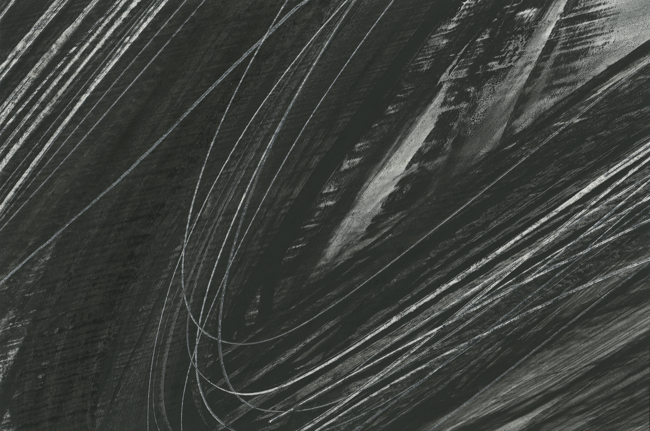
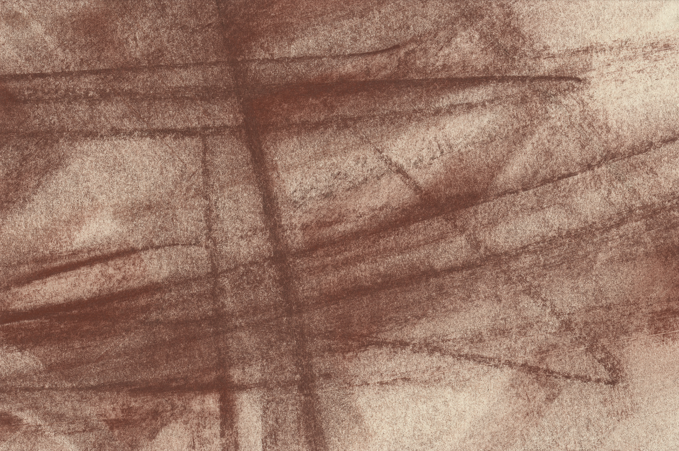
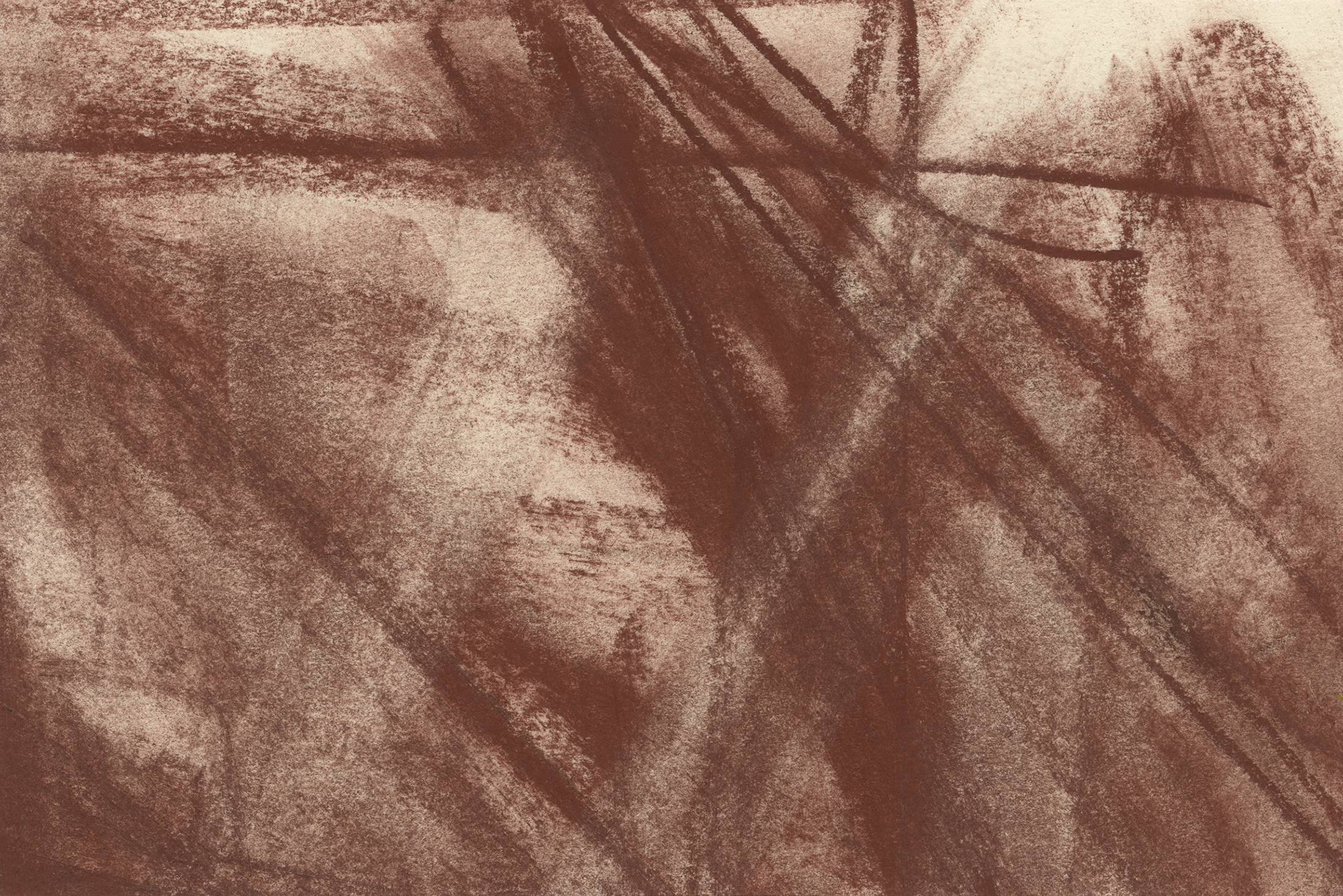
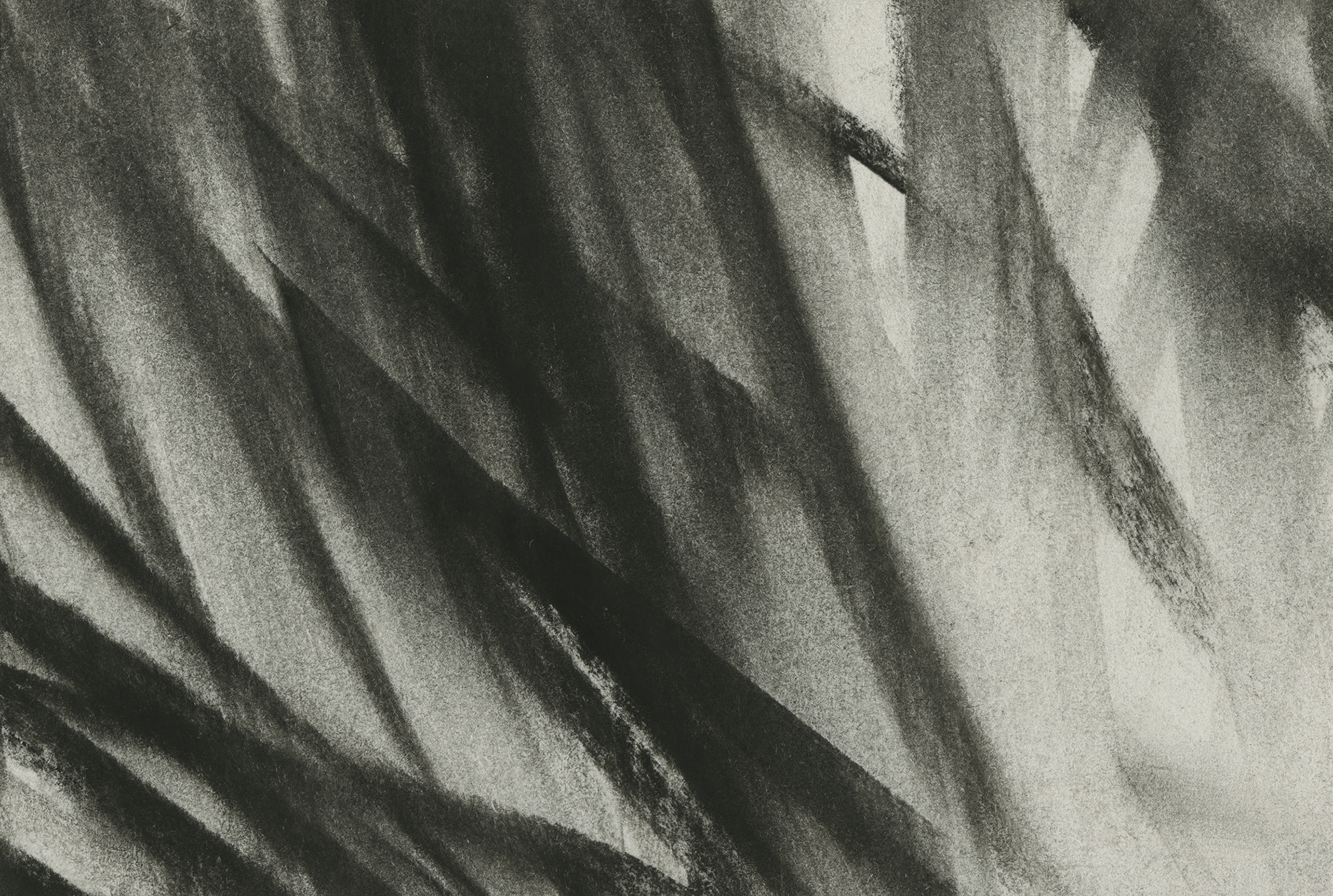
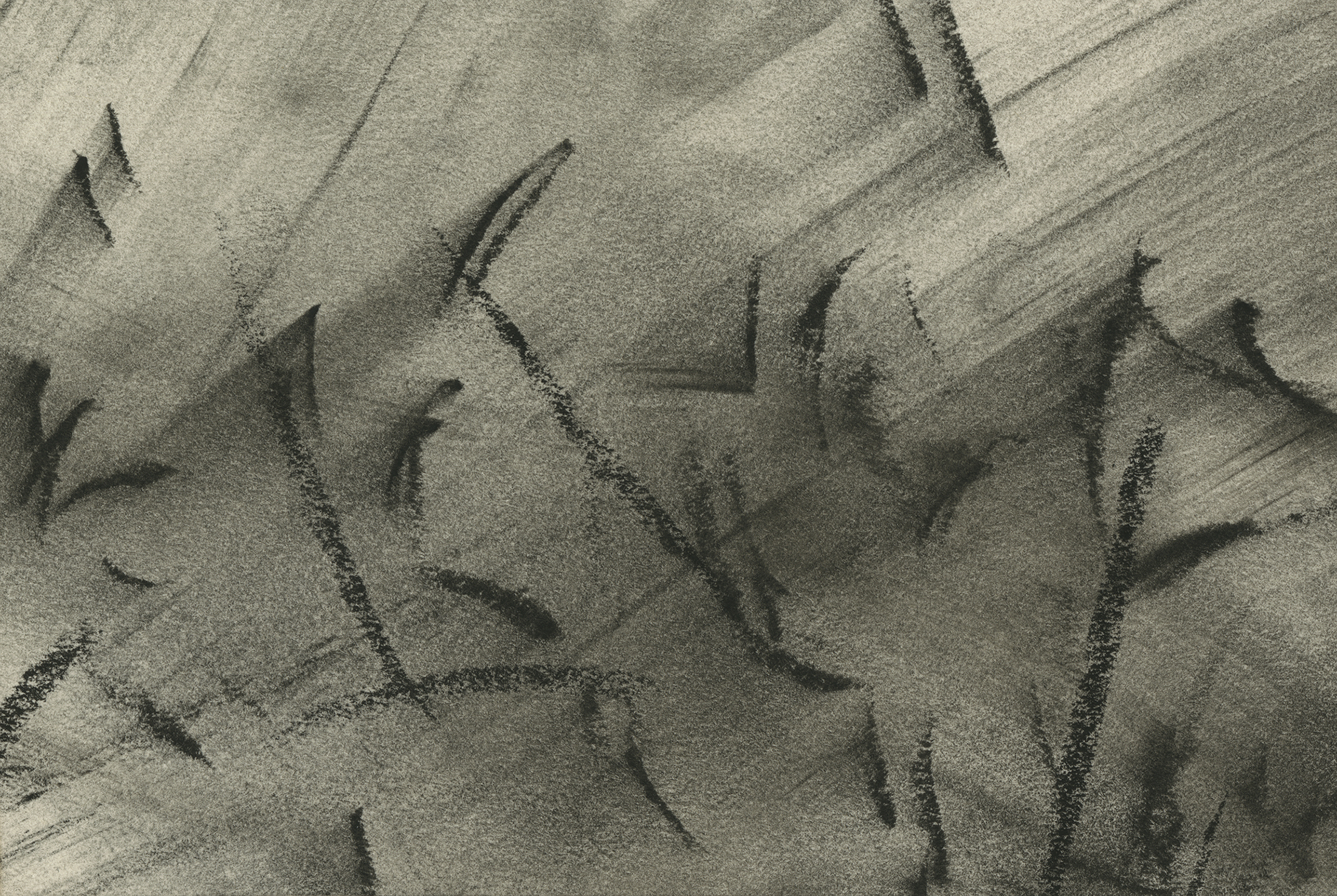
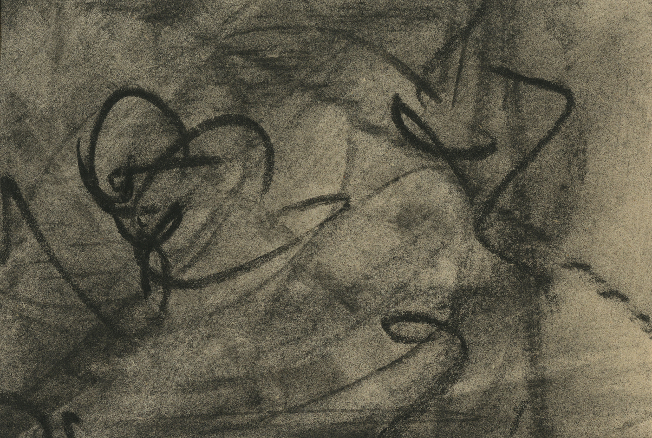
Frottage and Mark Making conté crayon, sanguine, and charcoal drawings, 2015
I presented a lecture Frottage and Mark Making which was followed by an artistic workshop for the art students. Rubbing the charcoal, graphite, sanguine, and conté crayons over the metal, wood, plastic, rubber, brick or concrete, I made unique monochromatic compositions. I was especially interested in high and low contrast compositions, tactile and visual texture. During a joyful but very rigorous creative process the students also made monochromatic pieces using different methods and media learning that happy accidents can be their ally. As an art educator I think that this assignment helps crucial comprehension of the foundations of art and contributes to understanding the elements and principles of design. In addition, this exercise helps students to develop his or her personal aesthetic and unique work of art.
2016: Presented at Purdue University Fort Wayne, College of Visual and Performing Arts, Department of Visual Communication and Design, Fort Wayne, Indiana, USA
2017: Presented at West Virginia Wesleyan College, School of Fine Arts and Humanities, Art & Design Department, Buckhannon, West Virginia, USA
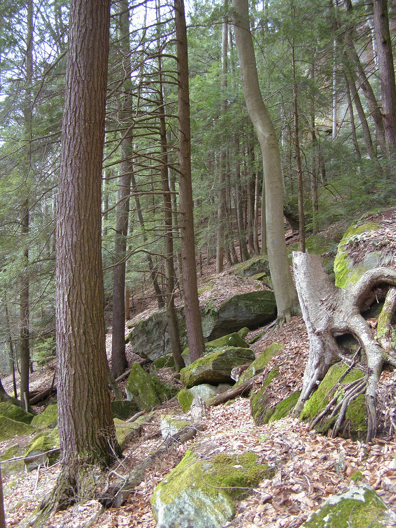
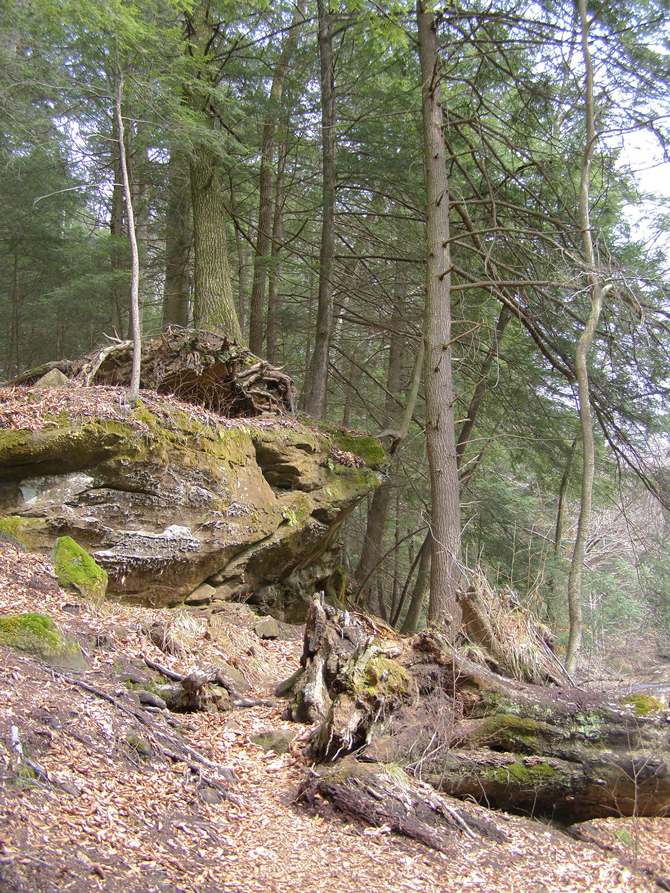
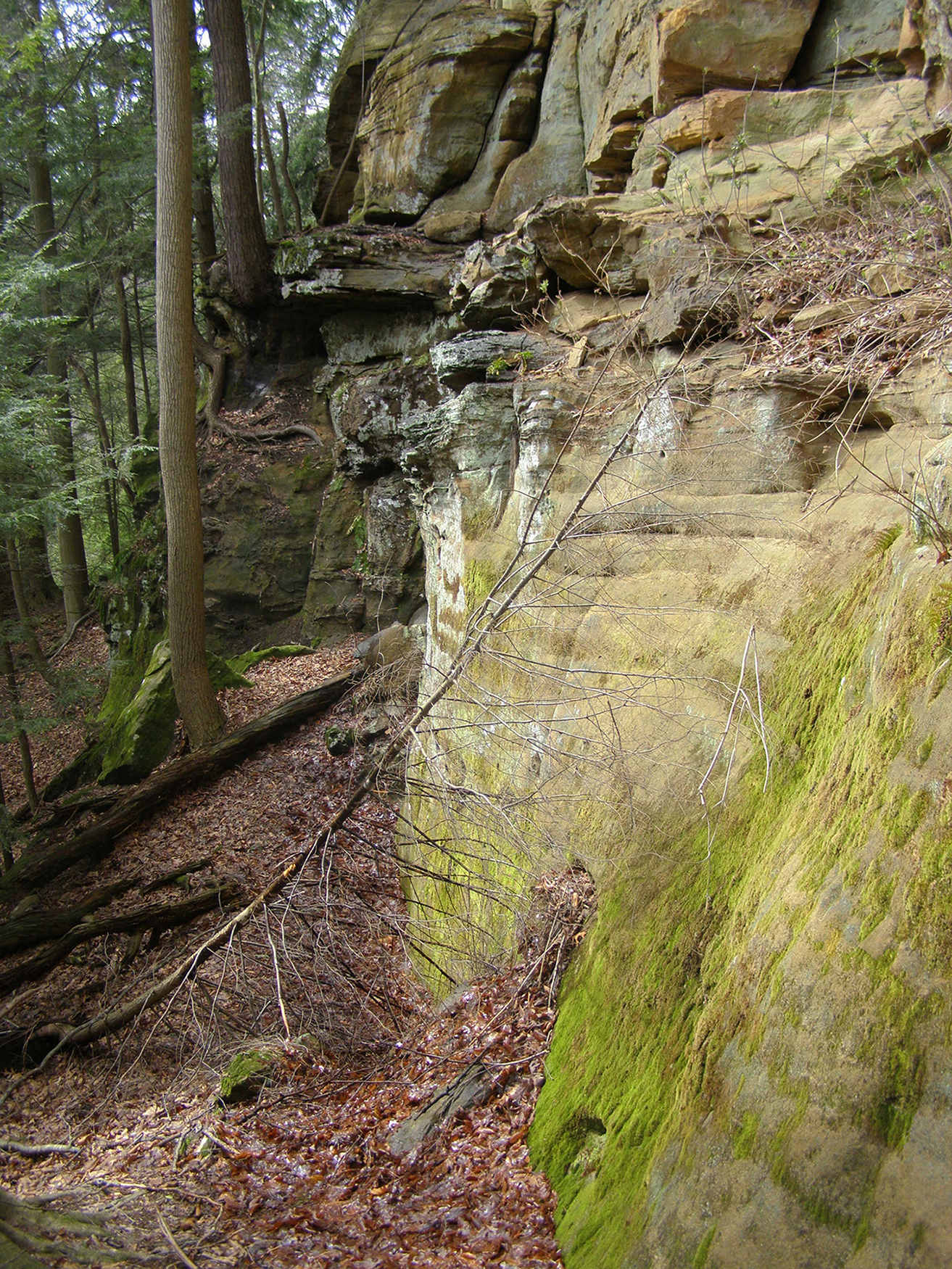
Hocking Hills State Park, Logan, Ohio series of photographs, 2015
In this series of photographs, I wanted to show the intact nature of Hocking Hills State Park which is part of the Appalachian Plateau in Ohio. I was also interested in capturing the tranquility and relaxing atmosphere of the beautiful, old forest.
2016: Selected for the 7th Lessedra International Painting & Mixed Media Exhibition, Lessedra Gallery, Sofia, Bulgaria
2016: Published in the catalog of the 7th Lessedra International Painting & Mixed Media Exhibition, Lessedra Gallery, Sofia, Bulgaria
Client: Wade Driving School, Lawton, Oklahoma, USA logo, 2015
When I was commissioned to design this logo, my first association was the experience of moving. A sporty, five spoke rim appears to be rotating very fast creating an illusion of a great speed. My inspiration also came from a five-pointed star which is the main element of The Great Seal of the State of Oklahoma. This logo invites student drivers to learn how-to drive-in Oklahoma and beyond.
2019: Wayland Baptist University Art Faculty Triennial Exhibition, Wayland Baptist University, the Abraham Art Gallery, Plainview, Texas, USA
2023: Selected for the 3rd Creative Bridge – Novosibirsk 2023, the international exhibition of design and visual arts, Novosibirsk State Museum of Local History and Nature, Novosibirsk, Russia
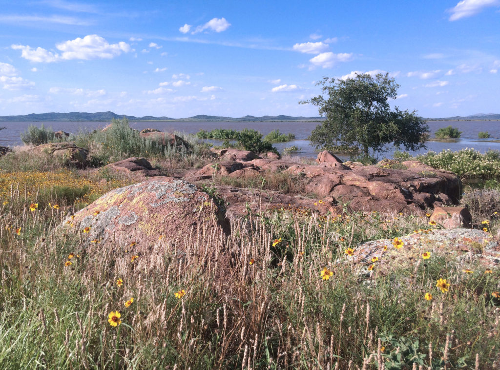
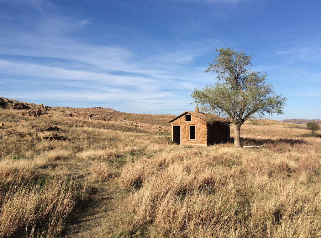
Wichita Mountains Wildlife Refuge, Indiahoma, Oklahoma art photograph, 2014
Wichita Mountains Wildlife Refuge is a hilly and prairie area in Oklahoma unique for its beauty. The red granite cobblestone house on the picture is typical for this area.
2017: Selected for the Wichita Falls Art Association 4th Annual Photography Exhibition, Wichita Falls Art Association Gallery, Wichita Falls, Texas, USA. The 3rd Place Award in the Landscape/Cityscape Category.
2019: Wayland Baptist University Art Faculty Triennial Exhibition, Wayland Baptist University, the Abraham Art Gallery, Malouf Abraham Family Art Center, Plainview, Texas, USA
Client: Dr. Randy Smoot, Campbellsville, Kentucky, USA, oral surgeon logo, 2014
Since so many dentists’ offices around the world use the tooth or teeth for their logo, I wanted to create something different. Dr. Smoot told me that he prefers letter designs which are used for branding cattle. Inspired by the long-time branding tradition in Kentucky, I decided to use the client’s initials for my design. The doctor’s surname, Smoot, was another inspiration: the letters need to be smooth to show his smooth style of working with patients. In this manually executed logo, my intention was to make a perfect symbiosis between the capital letters R and S which are “drawing” each other. Although I wanted an original typographic solution from the beginning, I also insisted on the perfect legibility of letters.
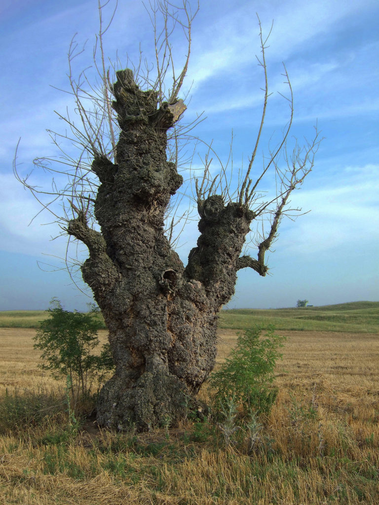
Old Mulberry, Deliblato Sands, Serbia art photograph, 2014
I took this photograph in Deliblato Sands, Special Nature Reserve in Banat, near Pančevo, Serbia. The Deliblato Sands (Deliblatska Peščara) is the largest sandy terrain in Europe.
2018: Selected for the Judged Art Show & Sale, Muskogee Art Guild Gallery, Muskogee, Oklahoma, USA
2019: Wayland Baptist University Art Faculty Triennial Exhibition, Wayland Baptist University, the Abraham Art Gallery, Malouf Abraham Family Art Center, Plainview, Texas, USA
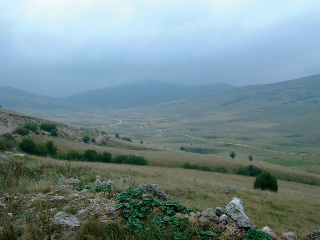
Bosnia was taken on the Manjača mountain in the Dinaric Alps. The picturesque and sleepy landscape is a strong contrast to the country’s recent troubled history.
2015: Selected for the exhibition Small Works, Limner Gallery, Hudson, New York, USA
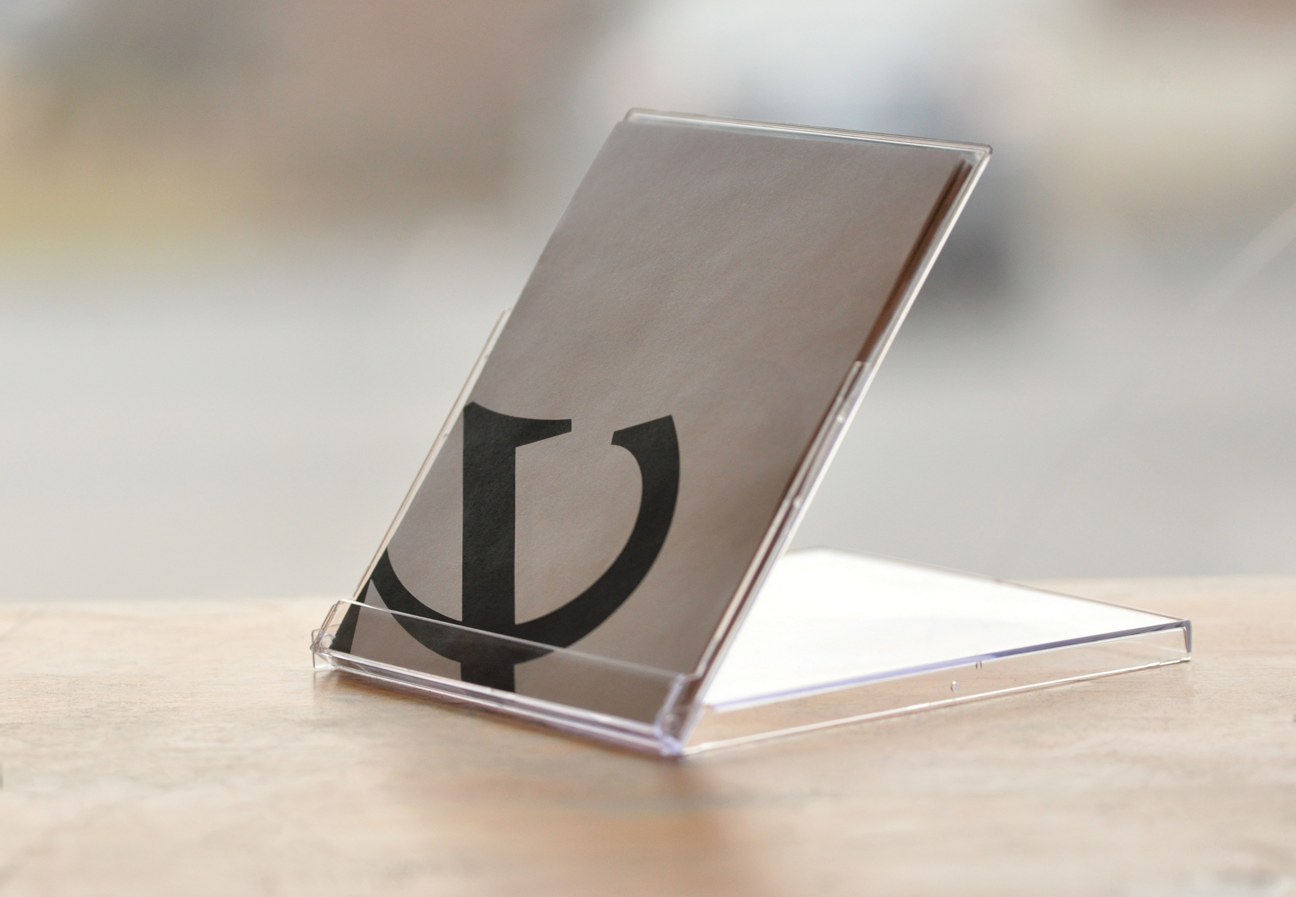
Campbellsville University Perpetual Calendar, Campbellsville, Kentucky, USA a desktop calendar, 2013
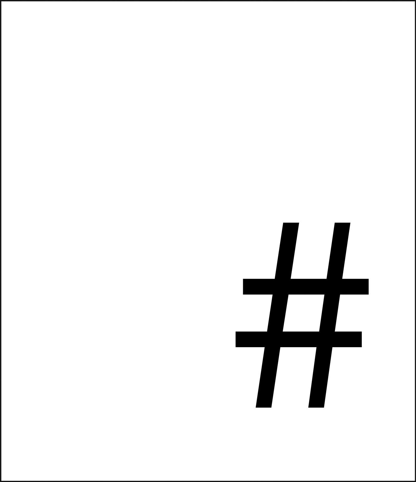
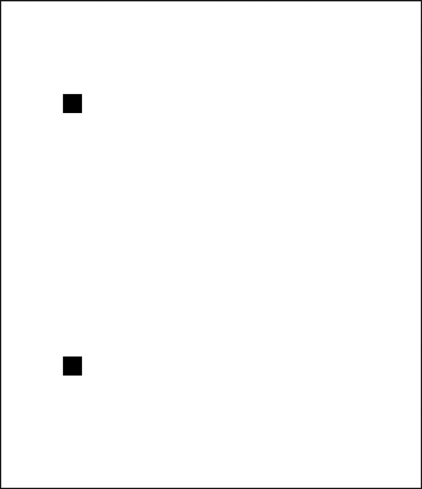
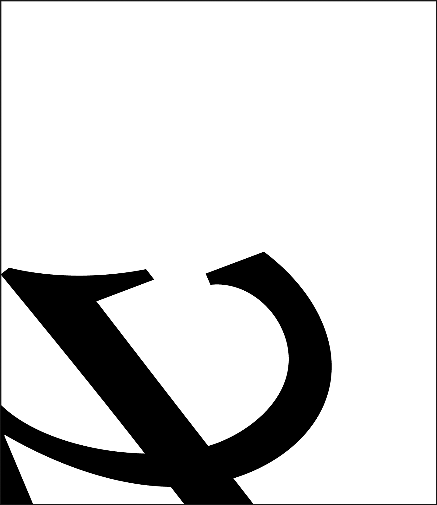
Calendars are tools that are used to measure and organize time. They are a necessity that permits individuals to function in society. Campbellsville University Perpetual Calendar was developed as a final project for Art 421 Typography during the last four weeks of the Spring Semester of 2013. In that project I was not only a Professor of Typography, Art Director, and Selector, but I also created six pages which are part of calendar: 1, 2, 3, 12, 21, and table of contents. Rather than create an electronic calendar I decided to produce an old school, paper format. We began with hand cutting and pasting typographic compositions consisting of numbers to 118 x 136 mm rectangles. This size is relative to the preexisting CD/DVD box that we used as a container to hold the pages of the calendar. There are sixteen pages in a box, with a typographic composition on each page for every day in a month. The 32nd page contains table of contents with all the designers’ names. These compositions are a result of playing with positioning, direction, scaling, overlapping and hierarchy of the characters. Not all designs are numerical: some are consisted of letters or symbols. For number 1 I used the number sign (#). This page serves as an “introduction” which invites the audience to immerse into engaging numerical and alphabetical compositions. Number 2 is colon (:) for which I used my font Serbiana. Number 3 is simple ellipsis (…), while the number 12 is a homage to the hammer and sickle. Number 21 is a humorous composition consisted of numbers 2 and 1 who fell into a box and got stuck.
2014: Selected for the 18th Exhibition of the Most Beautiful Calendars and Christmas Cards, ITD Gallery, Petrovaradin Fortress, Novi Sad, Serbia. The 1st Place Award for the Best Desktop Calendar
2014: Featured on Dnevnik, a prime-time news program on the (national) Radio Television of Vojvodina, Novi Sad, Serbia
2014: The calendar is included in the collection of the Museum of Vojvodina, Novi Sad, Serbia
2014: Campbellsville University Annual Art Faculty Exhibition, Campbellsville University, Pence-Chowning Art Gallery, Campbellsville, Kentucky, USA
2015: Presented during my typographic workshop at Ohio University, College of Fine Arts, School of Art + Design, Athens, Ohio, USA
2015: Presented during my typographic workshop at Carson-Newman University, Art Department, Jefferson City, Tennessee, USA
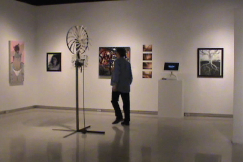
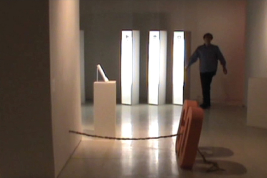
2013: Official Selection of the 2nd Queen City Film Festival, New Embassy Theatre, Cumberland, Maryland, USA
2013: Official Selection of the 3rd Bideodromo, International Experimental Film and Video Festival, ExpoGela Bilbao Historiko, Bilbao, Basque Country, Spain
2013: Official Selection of the 7th Riverside Saginaw Film Festival, Hoyt Library, Saginaw, Michigan, USA
2013: Official Selection of the 6th Wirral International Film Festival, the Little Theatre, Birkenhead, England, UK
2014: Official Selection of the 13th Dhaka International Film Festival, (film biennial), Bangladesh National Museum, Dhaka, Bangladesh
2014: Official Selection of the 6th Kastav Film Festival, Loža, Kastav, Croatia
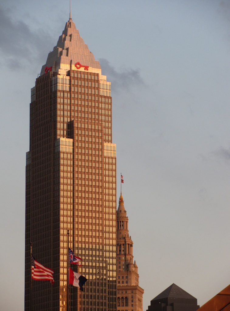
Key Tower is a skyscraper in Cleveland built between 1988 and 1991. With its 57 floors it is the tallest building in Ohio. This photograph was made during the golden hour.
2016: Selected for the Wichita Falls Art Association 3rd Annual Photography Exhibition, Wichita Falls Art Association Gallery, Wichita Falls, Texas, USA