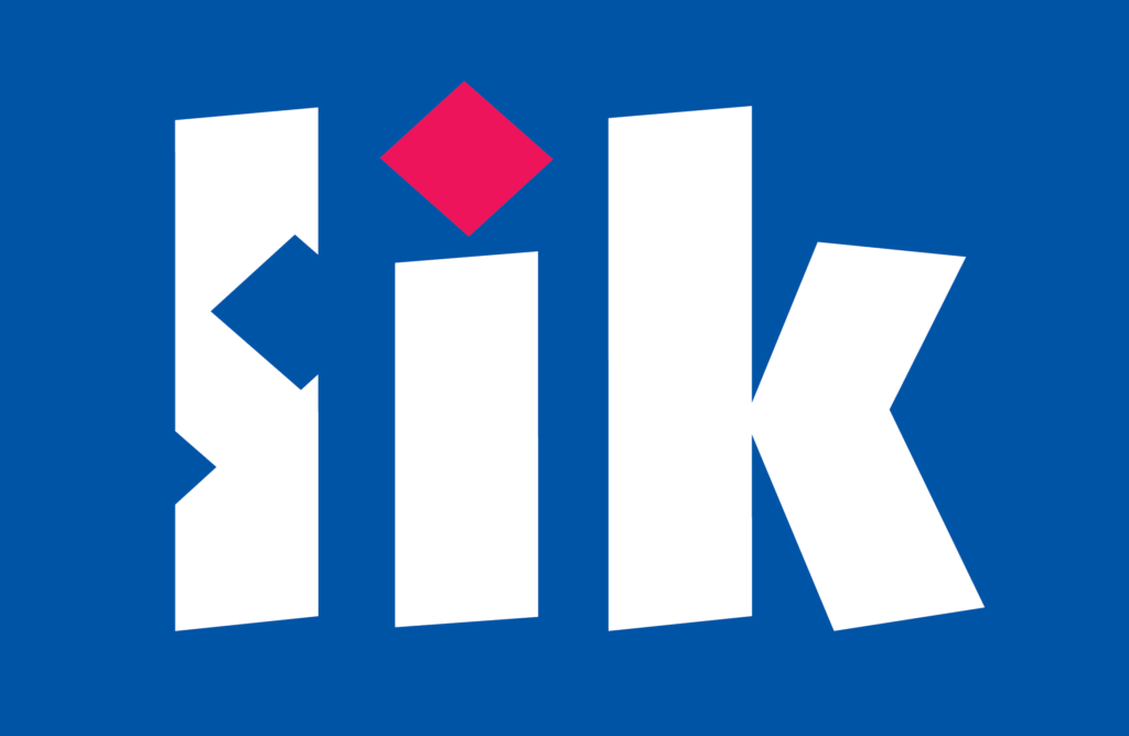
Lik
logotype, self-promotion, 2001
Lik in Serbian means shape. The red dot over the letter i came from the lower left corner. During a series of “jumps” the red dot made additional shapes (or holes) in the letter l creating typographic play.
2011: Published in the book Significity (anthology of the best 2500 Serbian and Yugoslav logos 1960-2010), Belgrade, Serbia