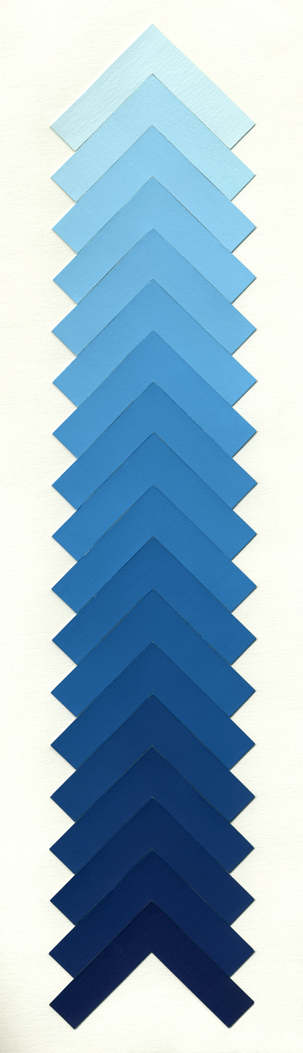
Color Explorations in Value
first image: tempera on paper, 2000
second and third composition: digital art, 2010
Value is used to make the illusion of light. The value is lightness or darkness of a color. To make a gradient with ten different color values, is a class assignment required in every art school in the world. That exercise helps to understand the color theory. Using the brush and tempera, I made eighteen different values of blue. Instead of simple squares, I used “arrows” for my steps. These pointed shapes additionally emphasize the gradual change of blue from the bottom to the top showing the shades (the dark values) and the tints (the light values). (A shade is a mixture of a color with black, while a tint is a mixture with white.) The highlights and shadows create the illusion of light source. The next two compositions were created on the computer. I scanned the paper with my gradient and imported it into Adobe Photoshop, where I played with position and direction of the color bars.